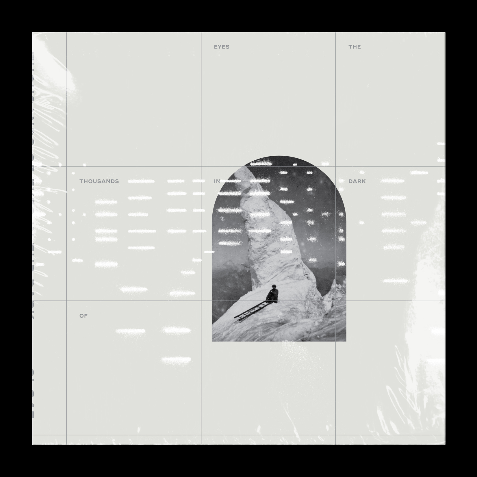
Thousands of Eyes in Dark
Various Artists
| A1 | SK U Kno– | Cut And Faze |
| A2 | Emily A. Sprague– | Mesa |
| A3 | Grand River– | This Was Us |
| A4 | Tadd Mullinix– | Woman In The Dunes |
| A5 | Sarah Davachi– | Sybil |
| B1 | Orcas– | Rills |
| B2 | Khotin– | Angel Epicenter |
| B3 | Saariselka– | Shepherd Canyon |
| B4 | Space Afrika– | Canu |
| B5 | Yosi Horikawa– | Thalfang |
Direction and Design
Michael Cina
Found Photography
Sam Valenti
![]()
Published by The Ghostly International Company (ASCAP)
Michael Cina
Found Photography
Sam Valenti
| Ghostly International GI-345 | |
| SMM – XXIX | |
| Released on Nov 15, 2019 | |

Published by The Ghostly International Company (ASCAP)
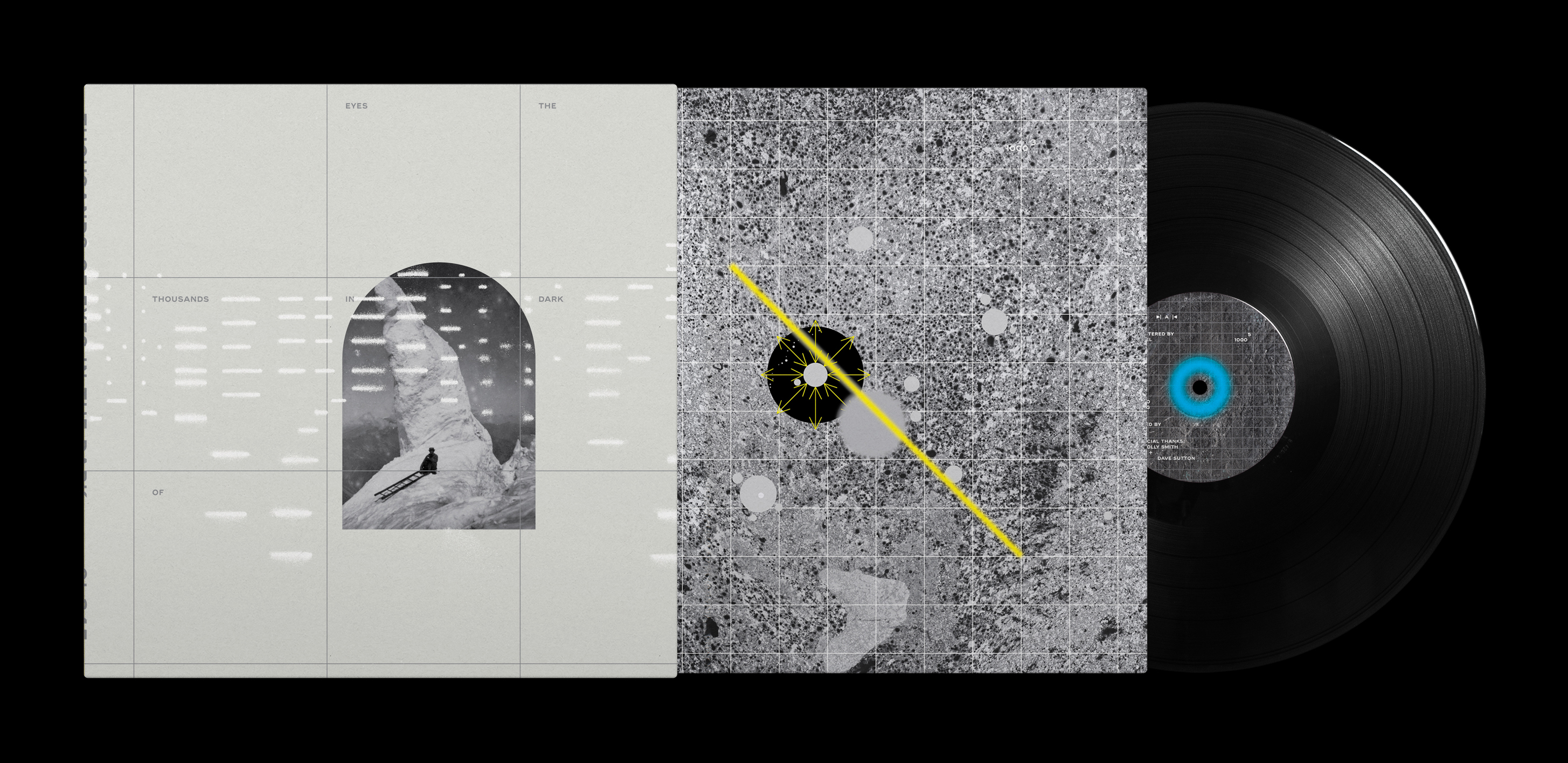 Package Spread
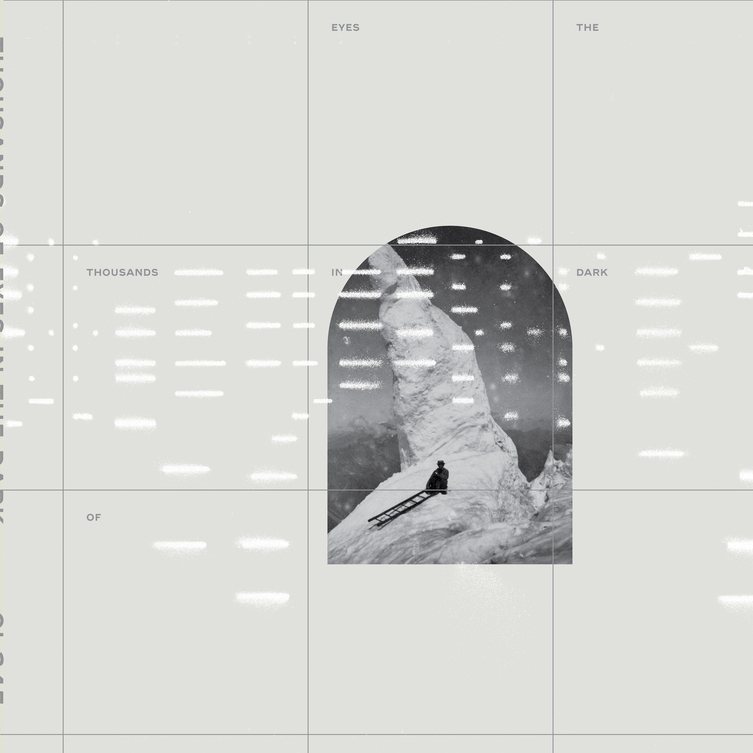
Cover_Front

Cover_Front
Cover_Inside_Front

Cover_Inside_Front
 A
A B
B


Sticker
Label Art
Thousands
Process
The most important product of creativity is the process.
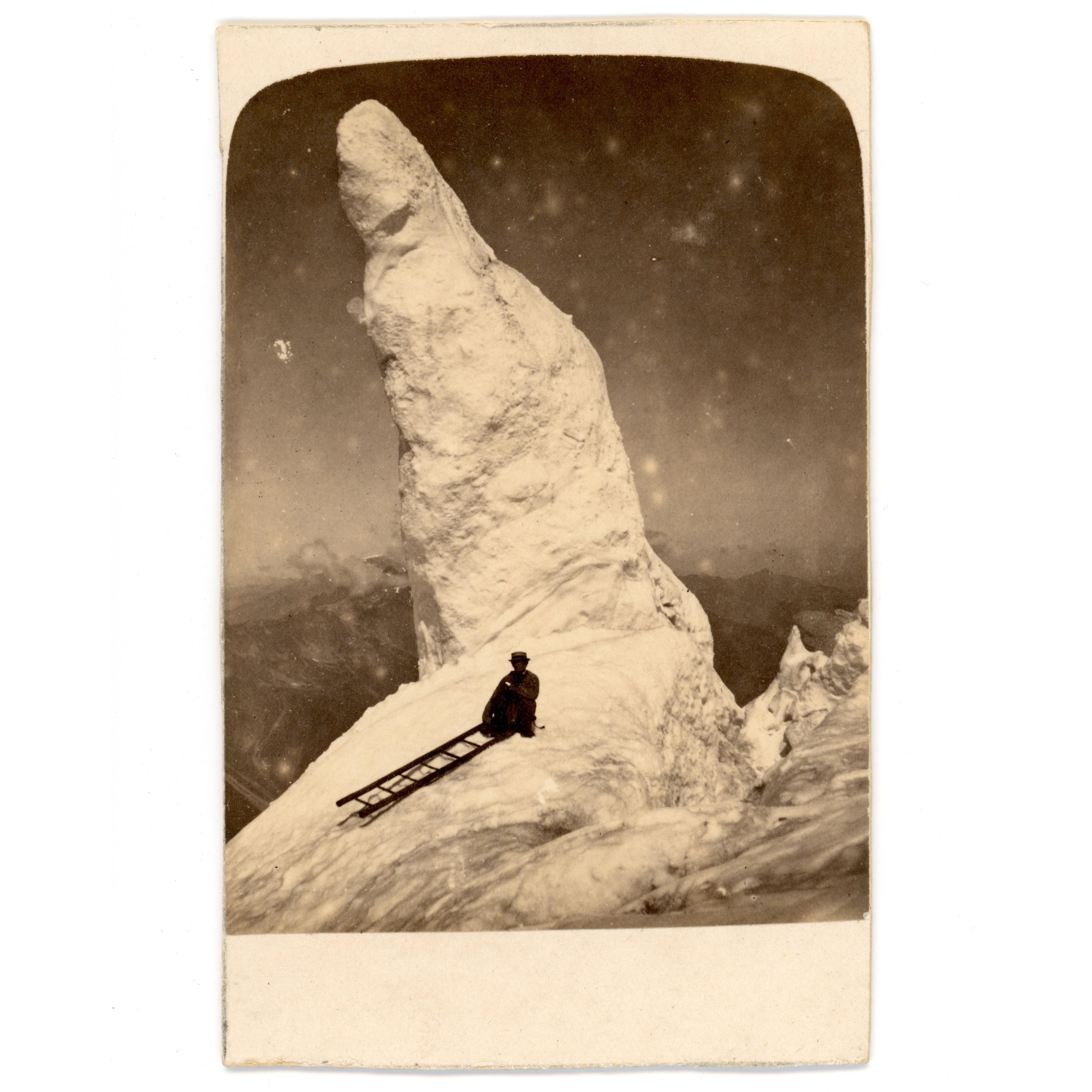 Found photo by Samuel Valenti IV
︎︎︎ Order to chaos. Chaos to order.
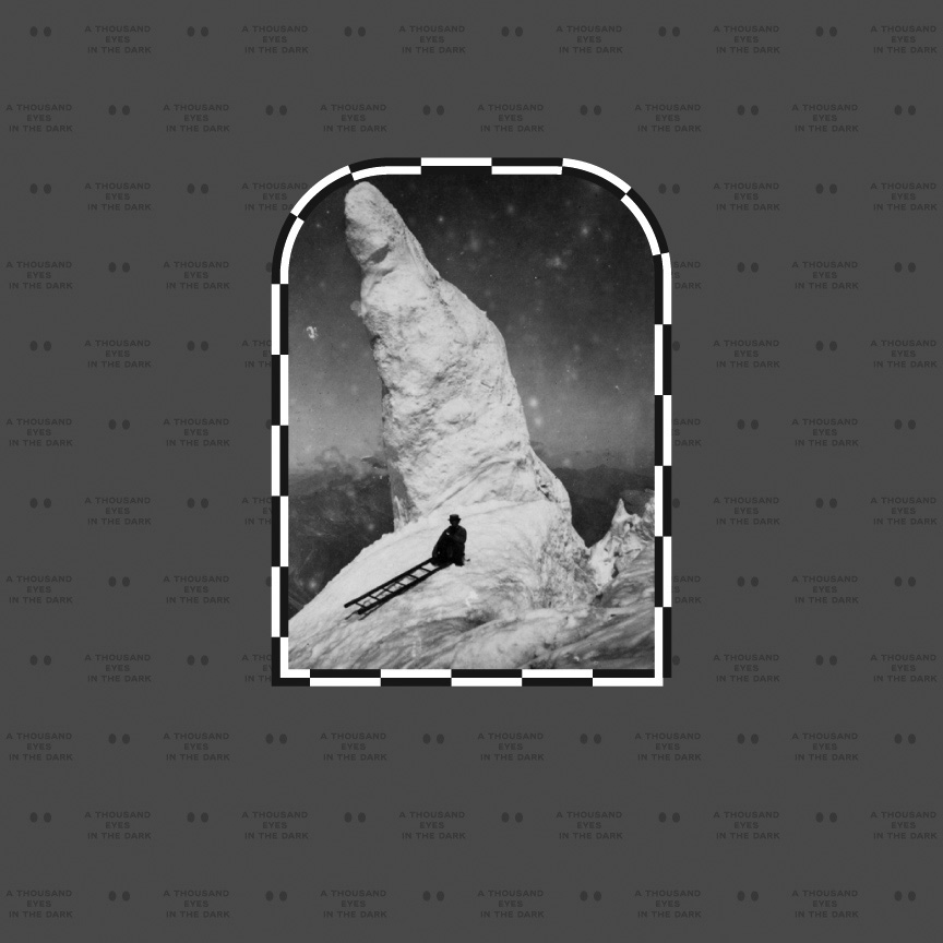
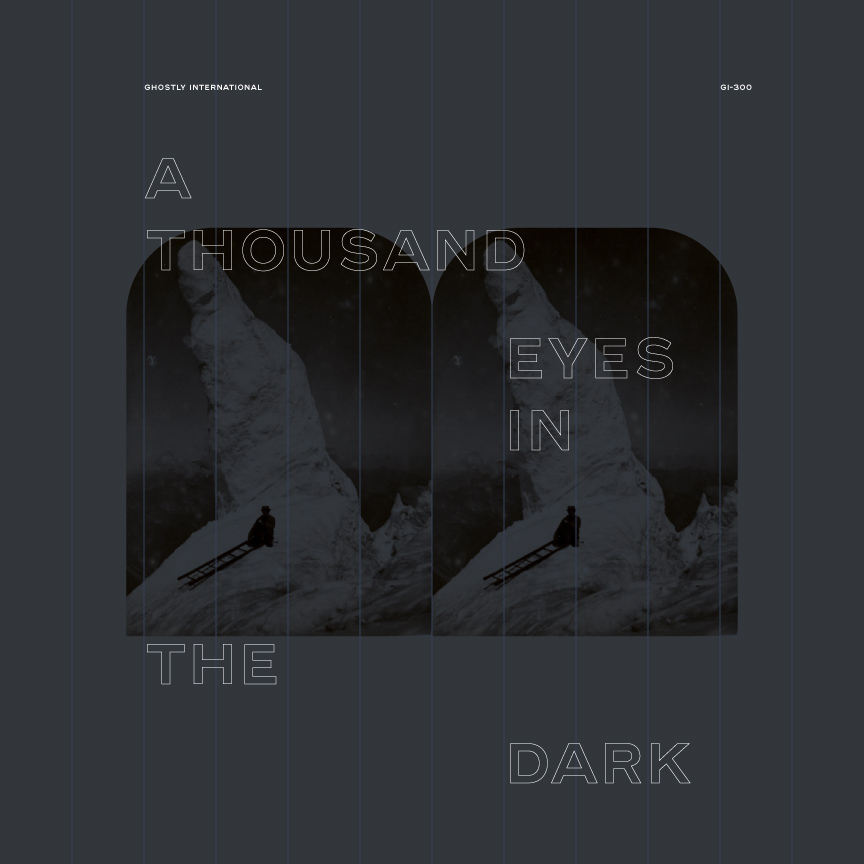
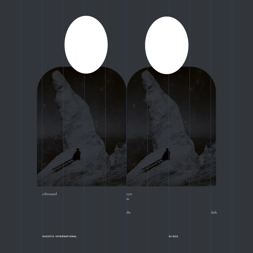
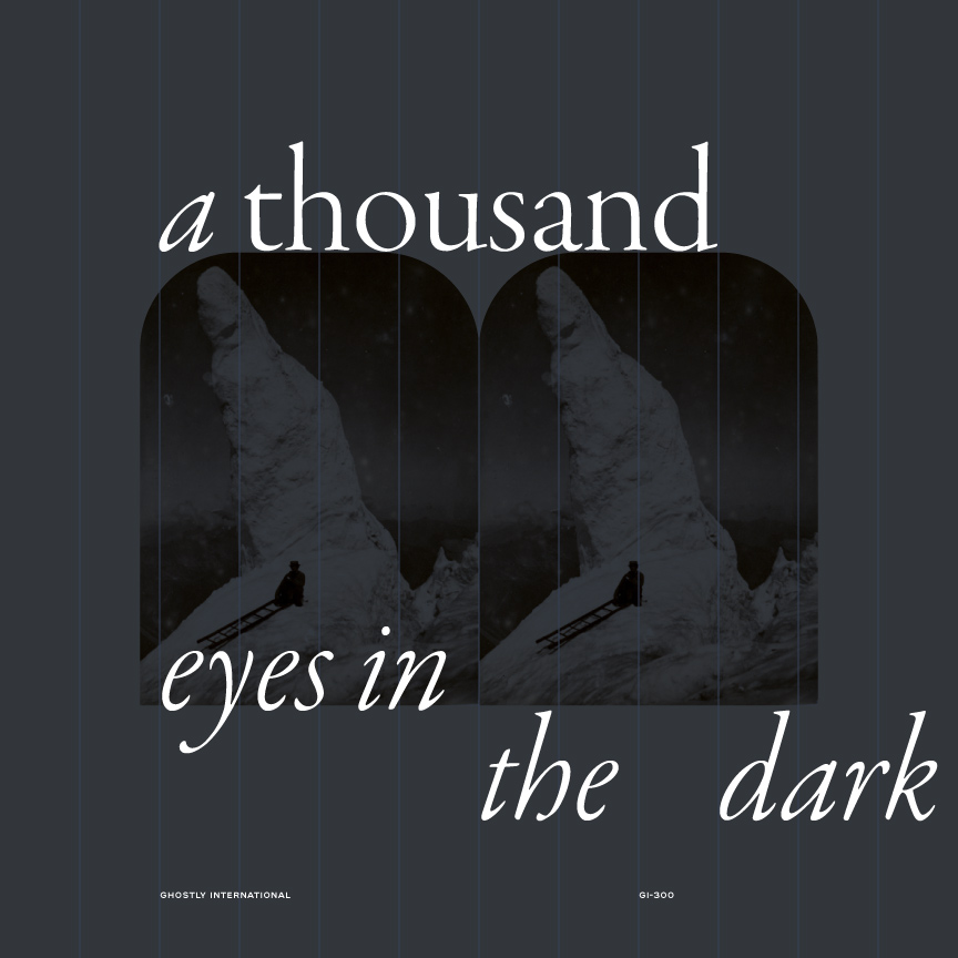
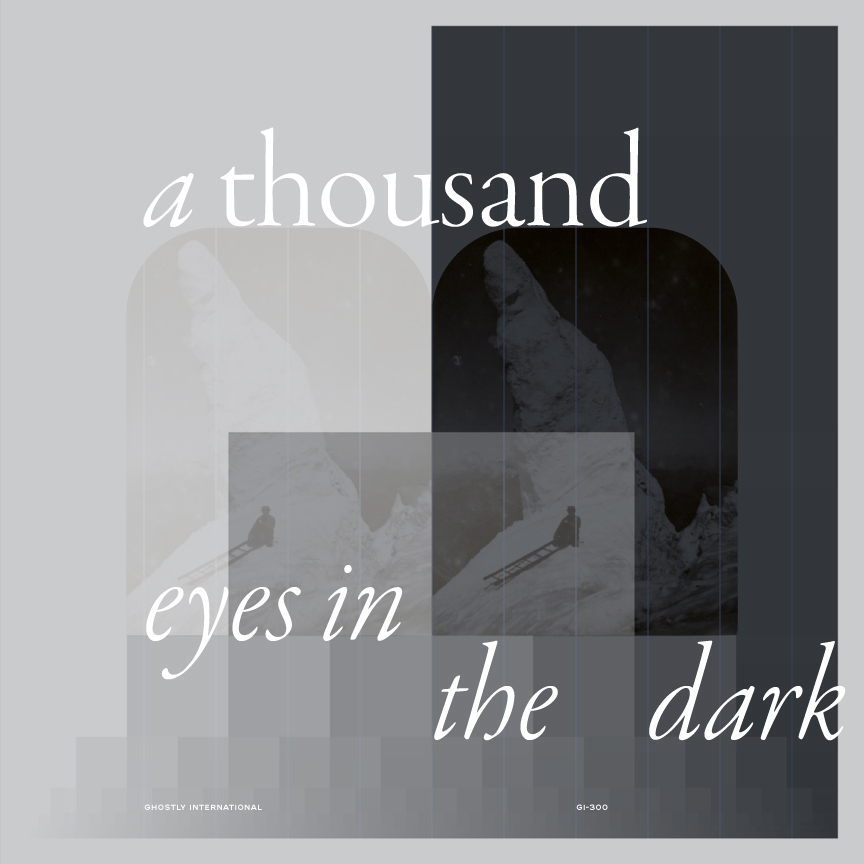
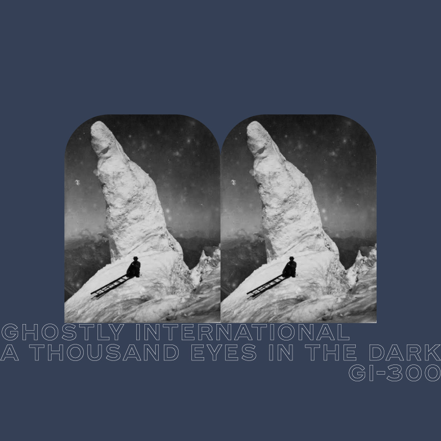
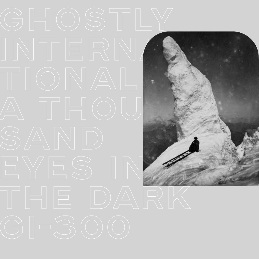
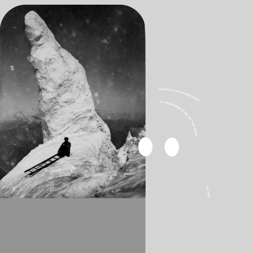
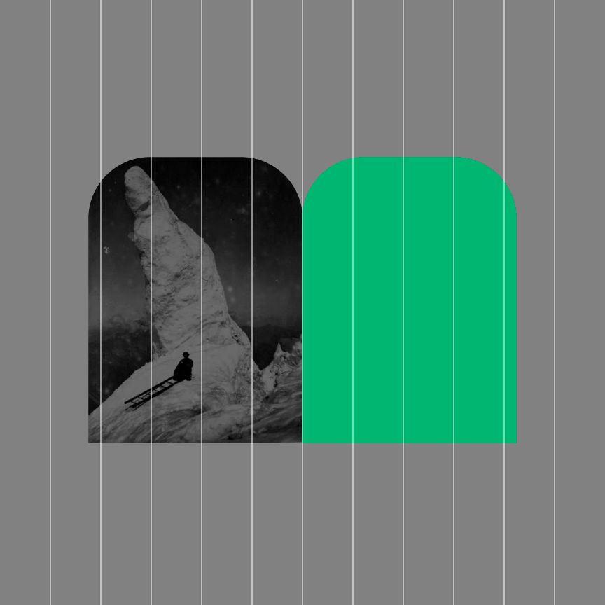
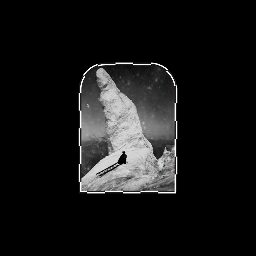
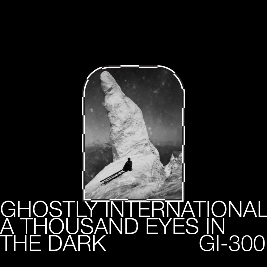
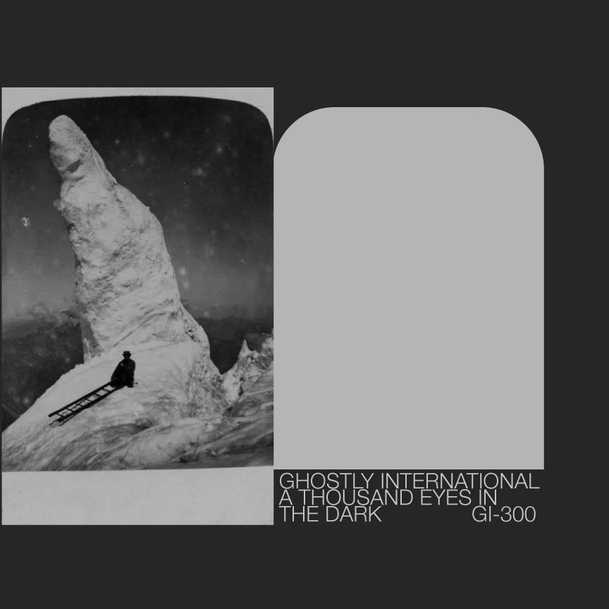
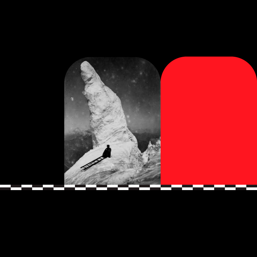
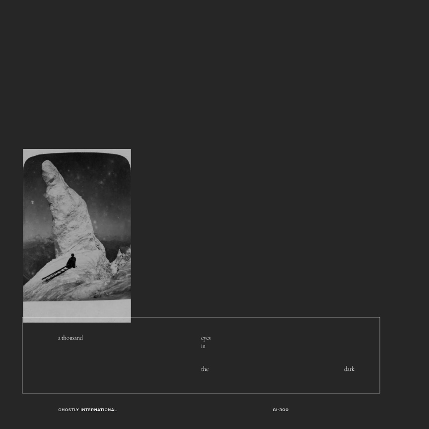
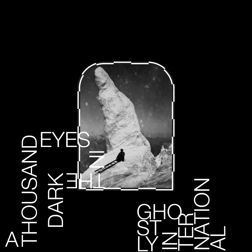
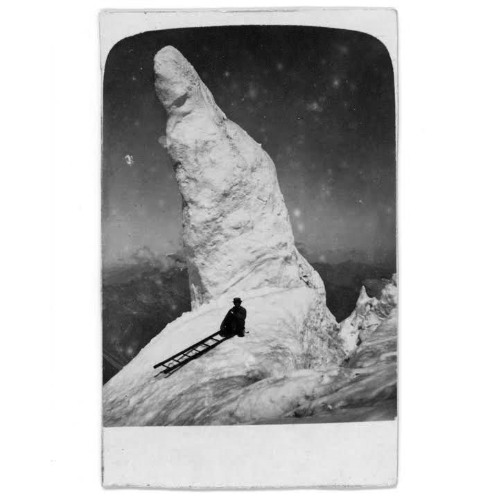
Every project is different. In the music realm, sometimes musicians have no idea what they want, some people have a concept or a vibe, and some people know exactly what they want. This project started with a “use it if you want” photo and the title “Thousands of Eyes in the Dark” by Sam Valenti IV. I didn't really ask any questions, so to this day, I have no idea what the photo is or where it came from.
I did a lot of thinking about the title and how it related to the photo and began to see them as inseparable. What does it all mean? I think the obvious conclusion would be to say - you are always being watched, you are never truly alone. The photo has a deeper theme of isolation. Someone who took a ladder from one world to another to escape. As an extreme introvert, I understood this sentiment well.
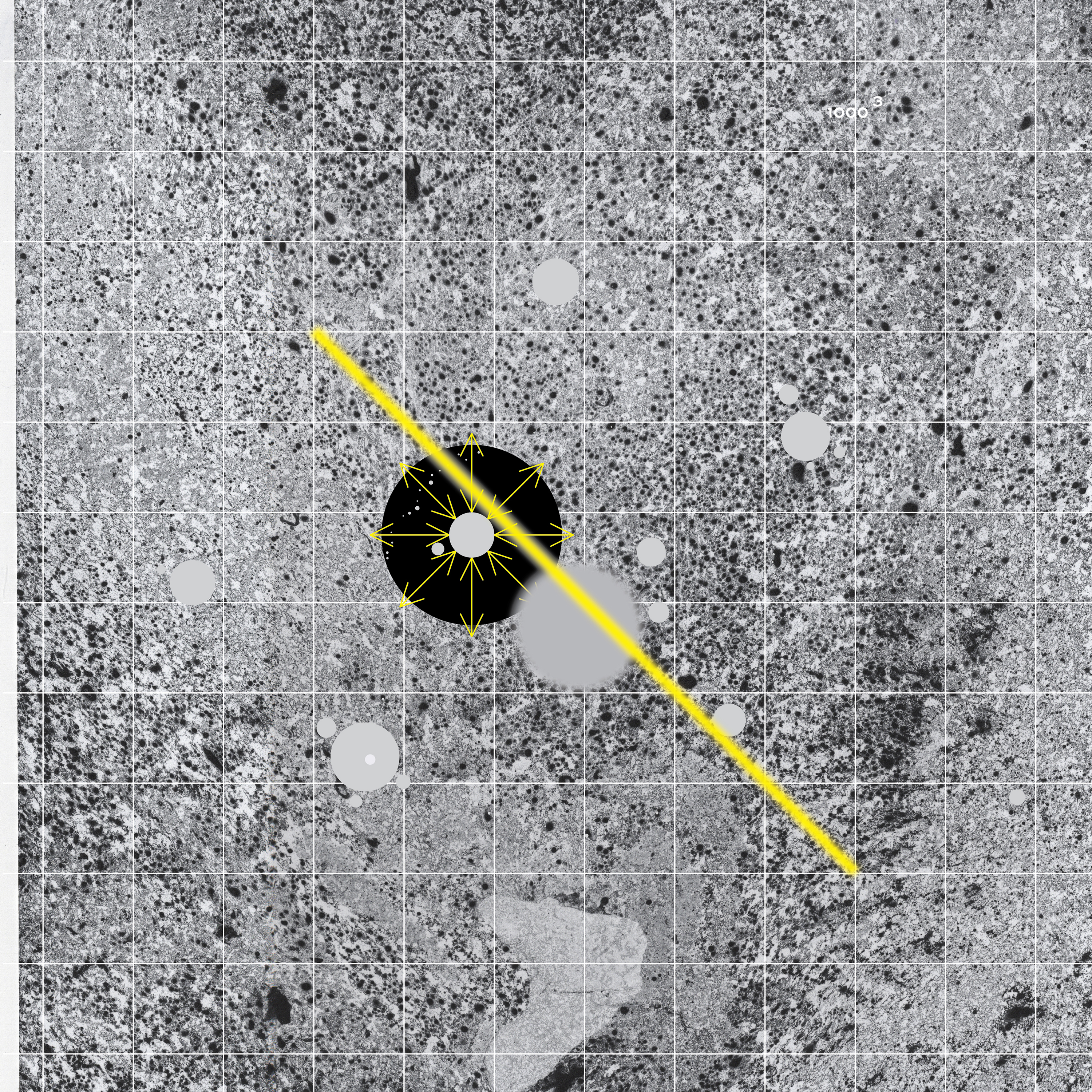
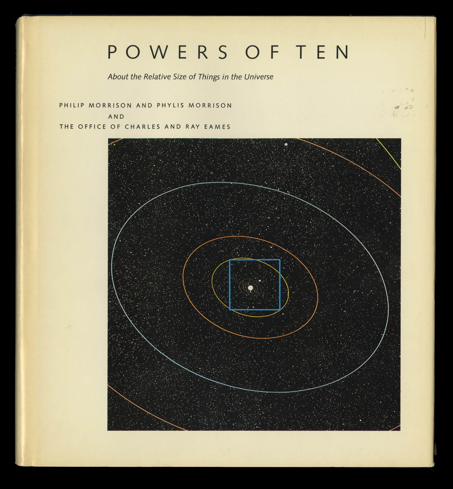
From the start, I had many preliminary ideas, but the one that I kept coming back to was a journey from one point to another. I explored the idea of mapping that journey, almost like Eames “Power of Ten.” We start with the silhouetted person's body and end with the vast celestial bodies. I felt like this captured the title well, being alone in the universe.
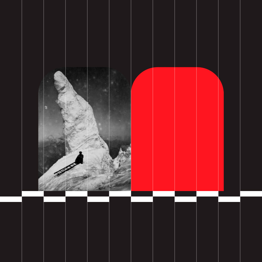
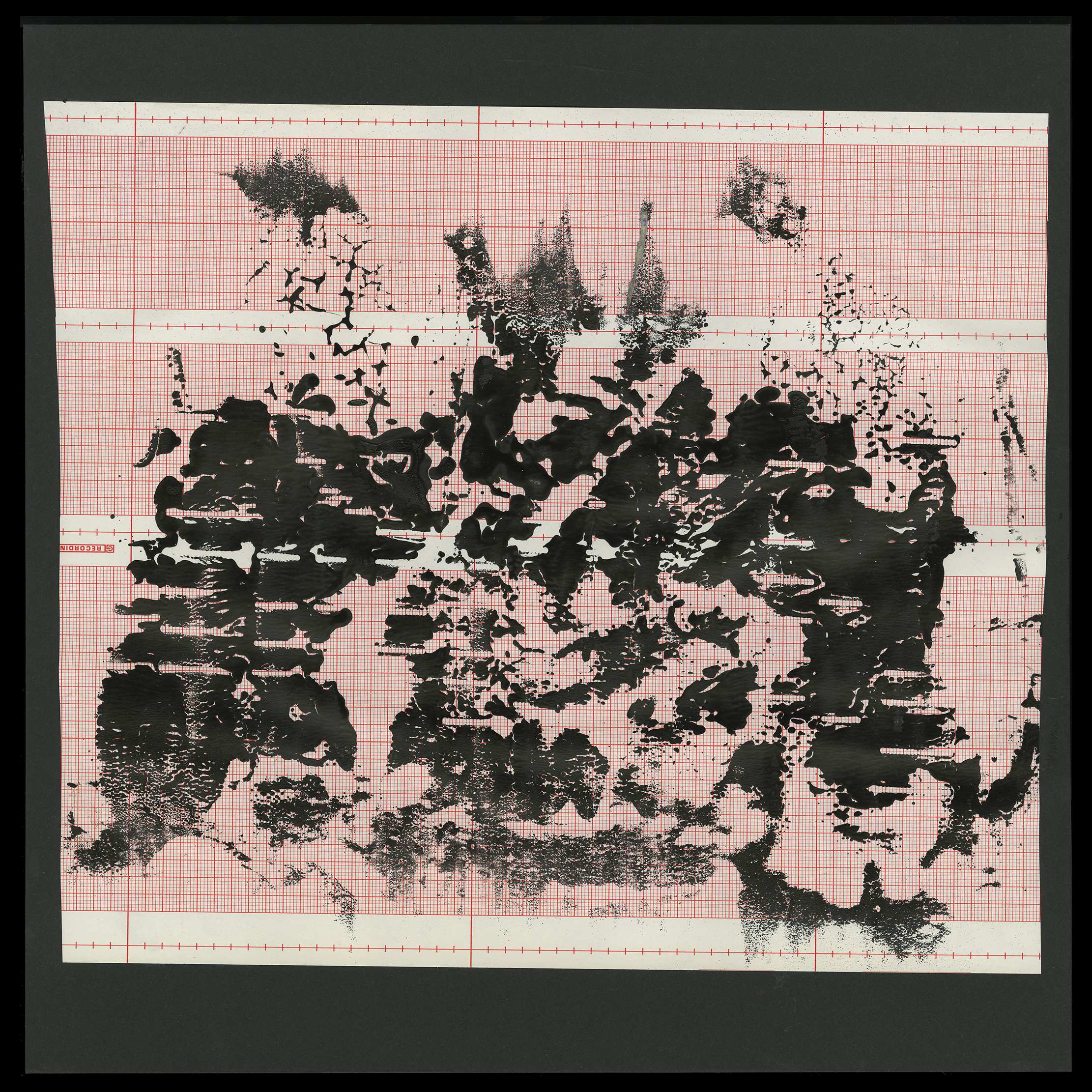
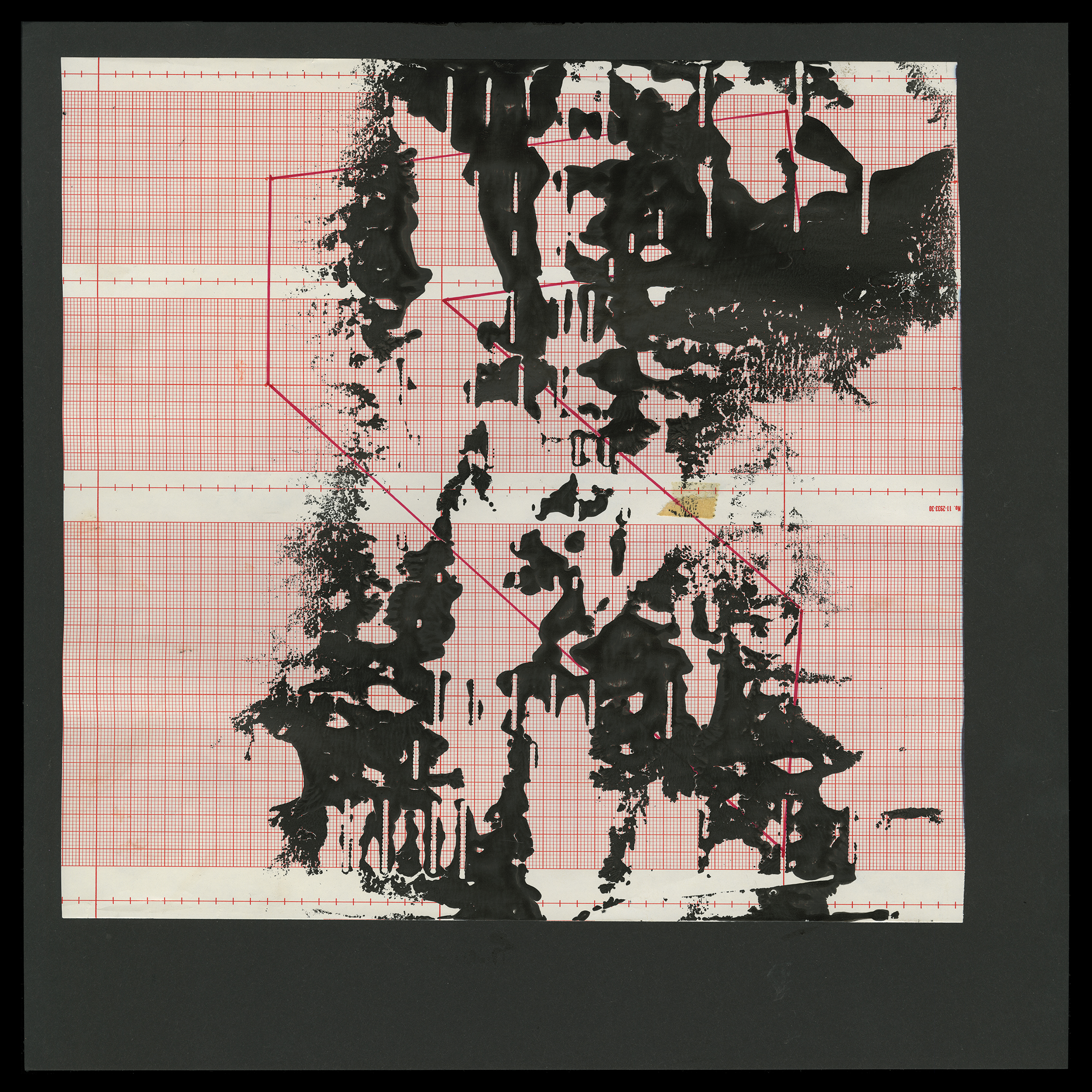
A grid is used to denote space. The cover starts with a grid that zooms out on the back cover to show the relation of the photo to the location of the photo on the planet. The inside front panel shows the solar system and the back progresses to the universe. The labels pick up and show a tight grid and the b side is so finite that the grid disappears as if you zoomed into a molecule, starting the cycle once again.
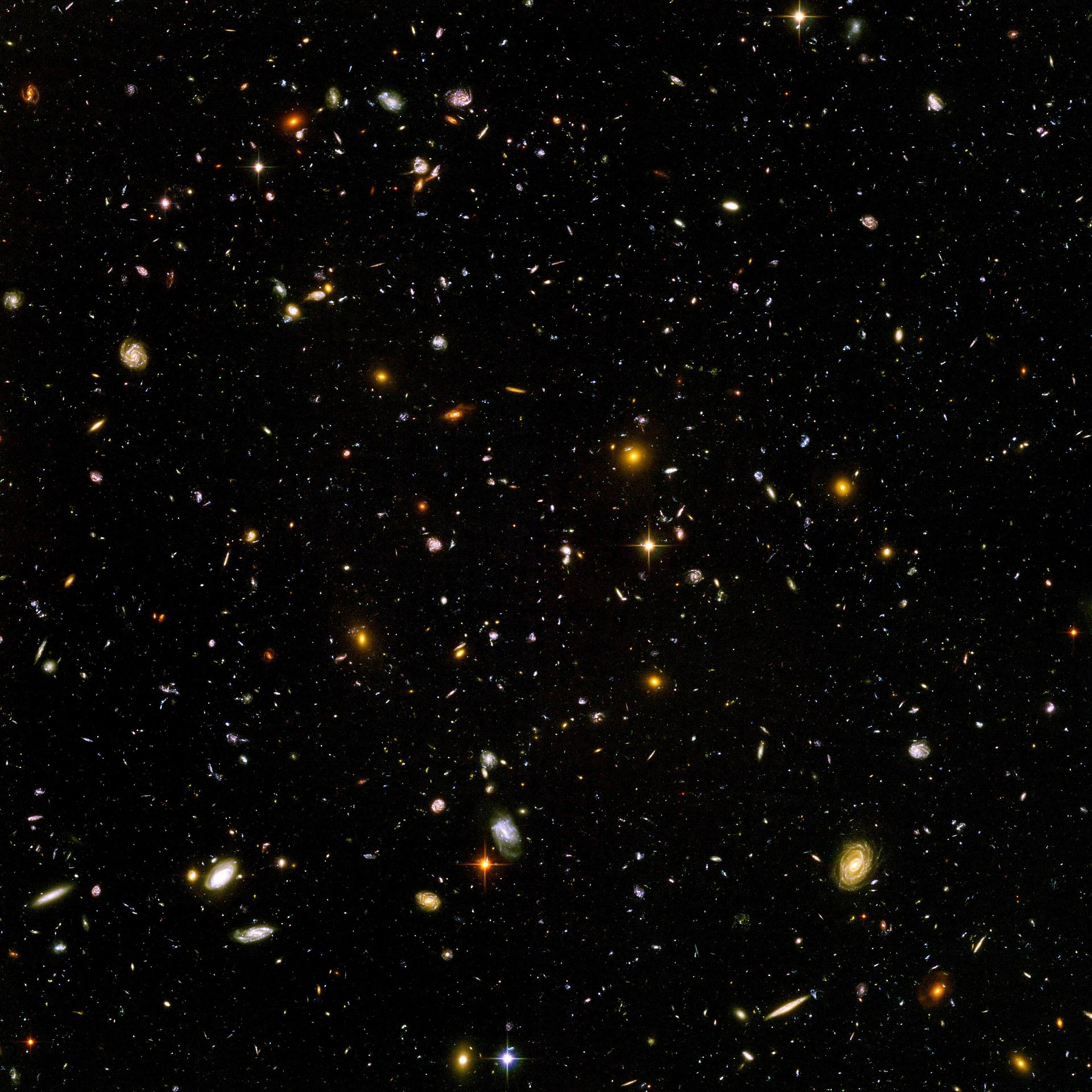
The Hubble Ultra-Deep Field image shows some of the most remote galaxies visible with present technology, each consisting of billions of stars. (The apparent image area is about 1/79 that of a full moon)
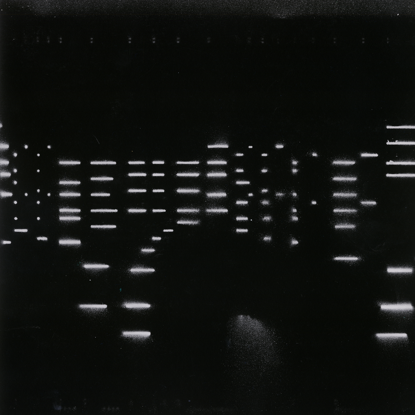
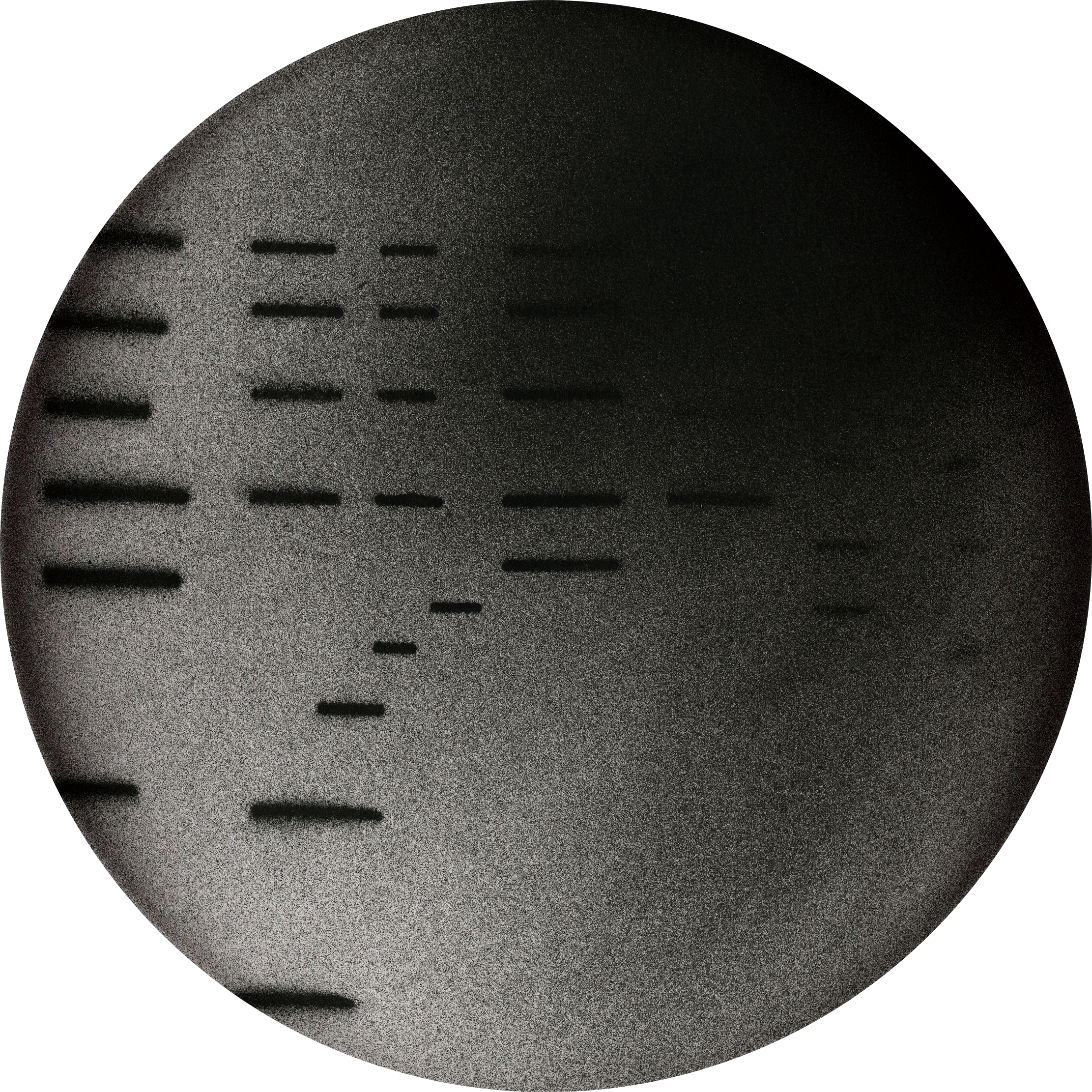
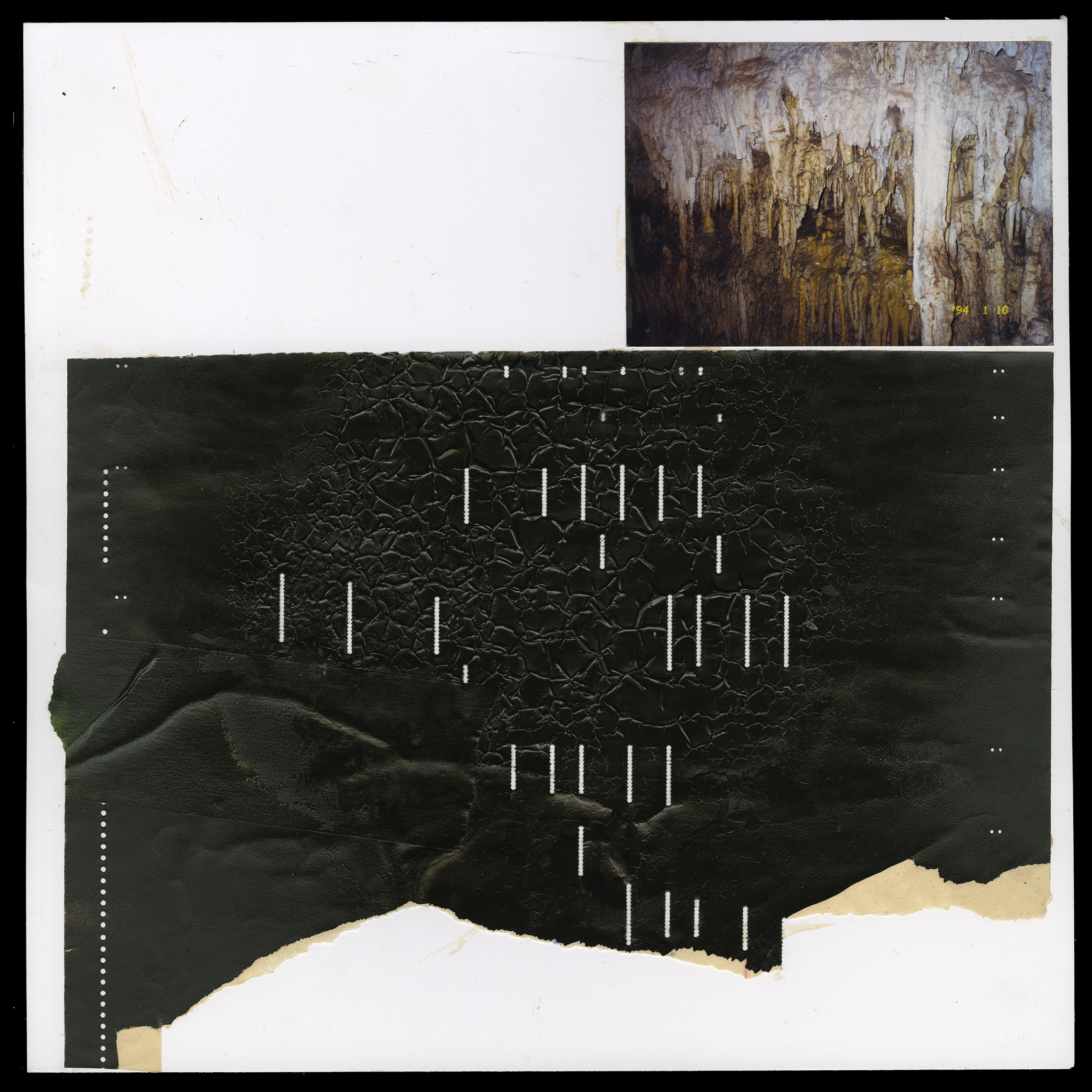
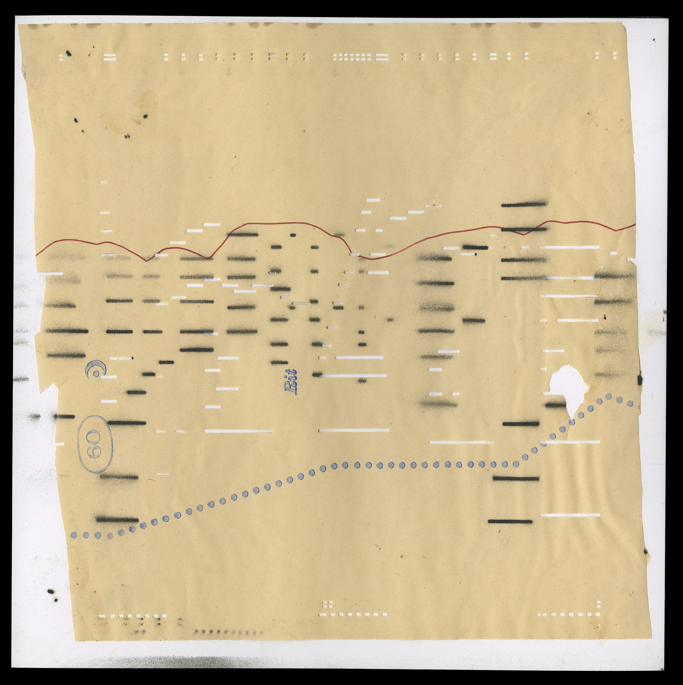
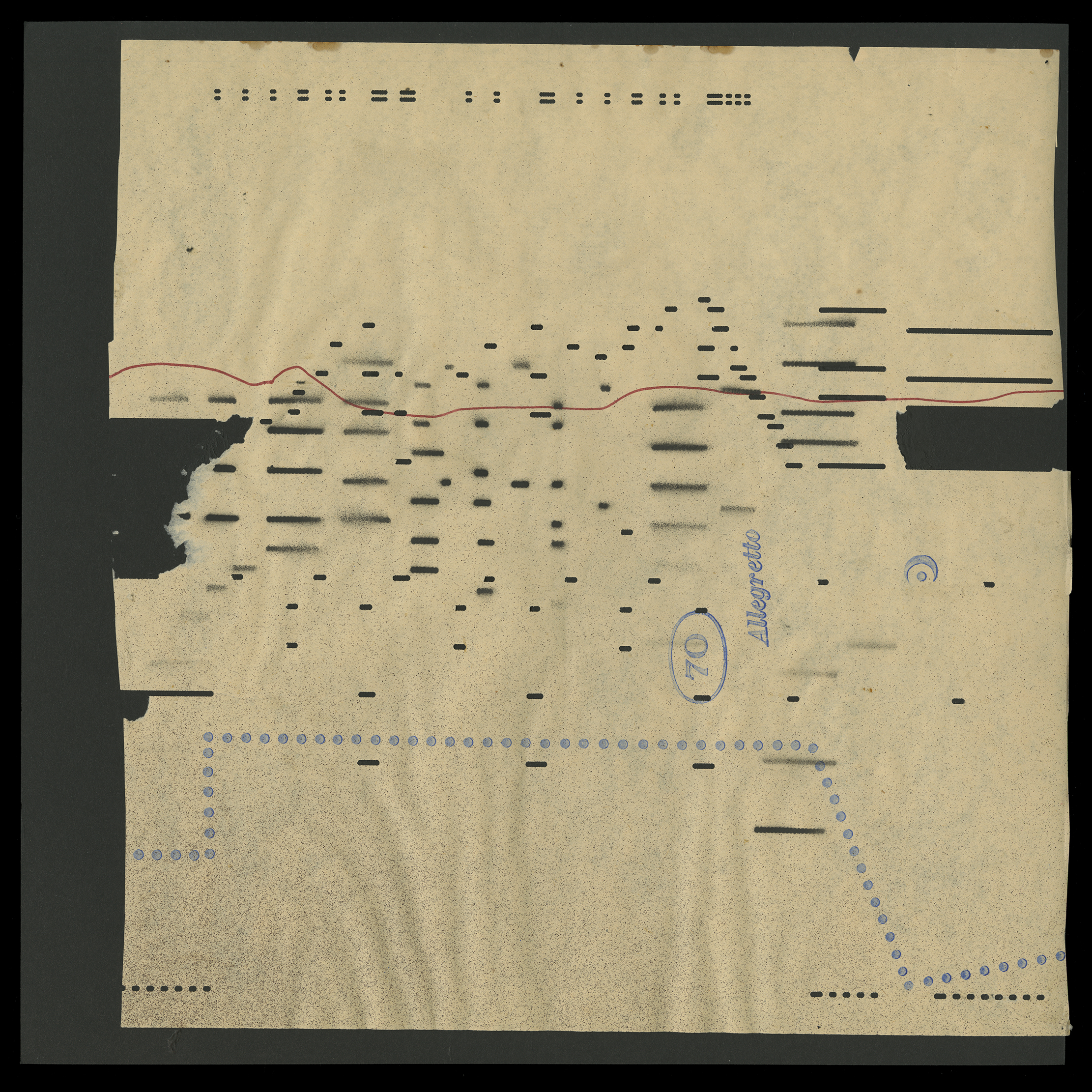
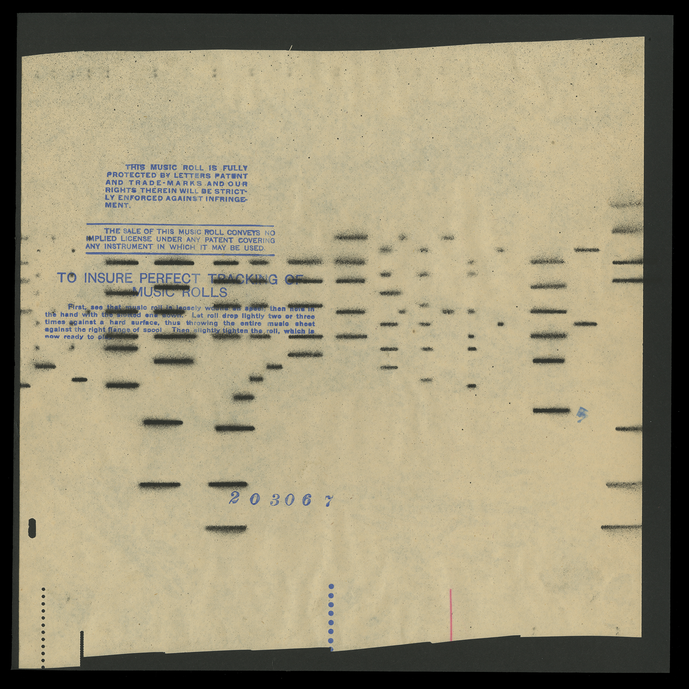
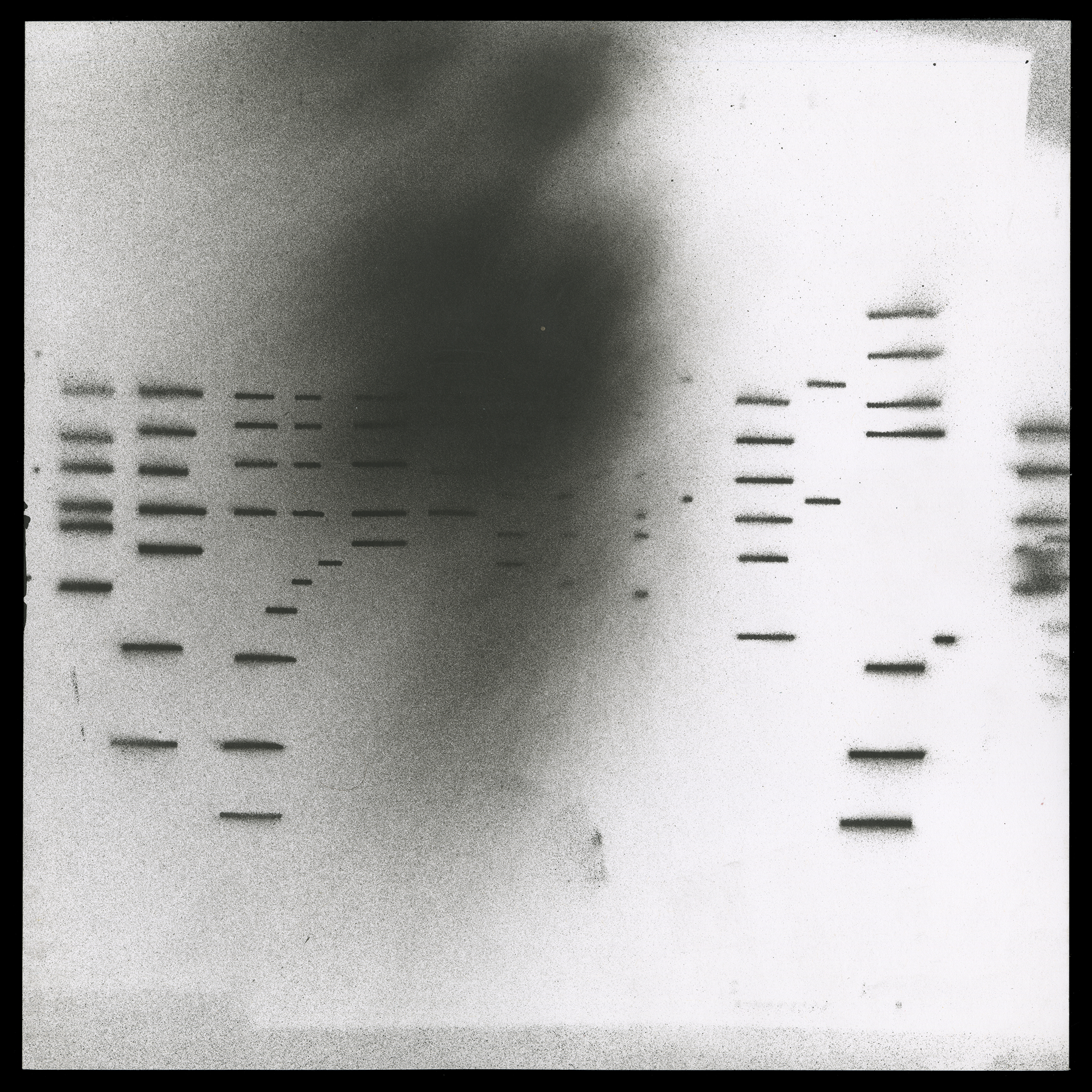
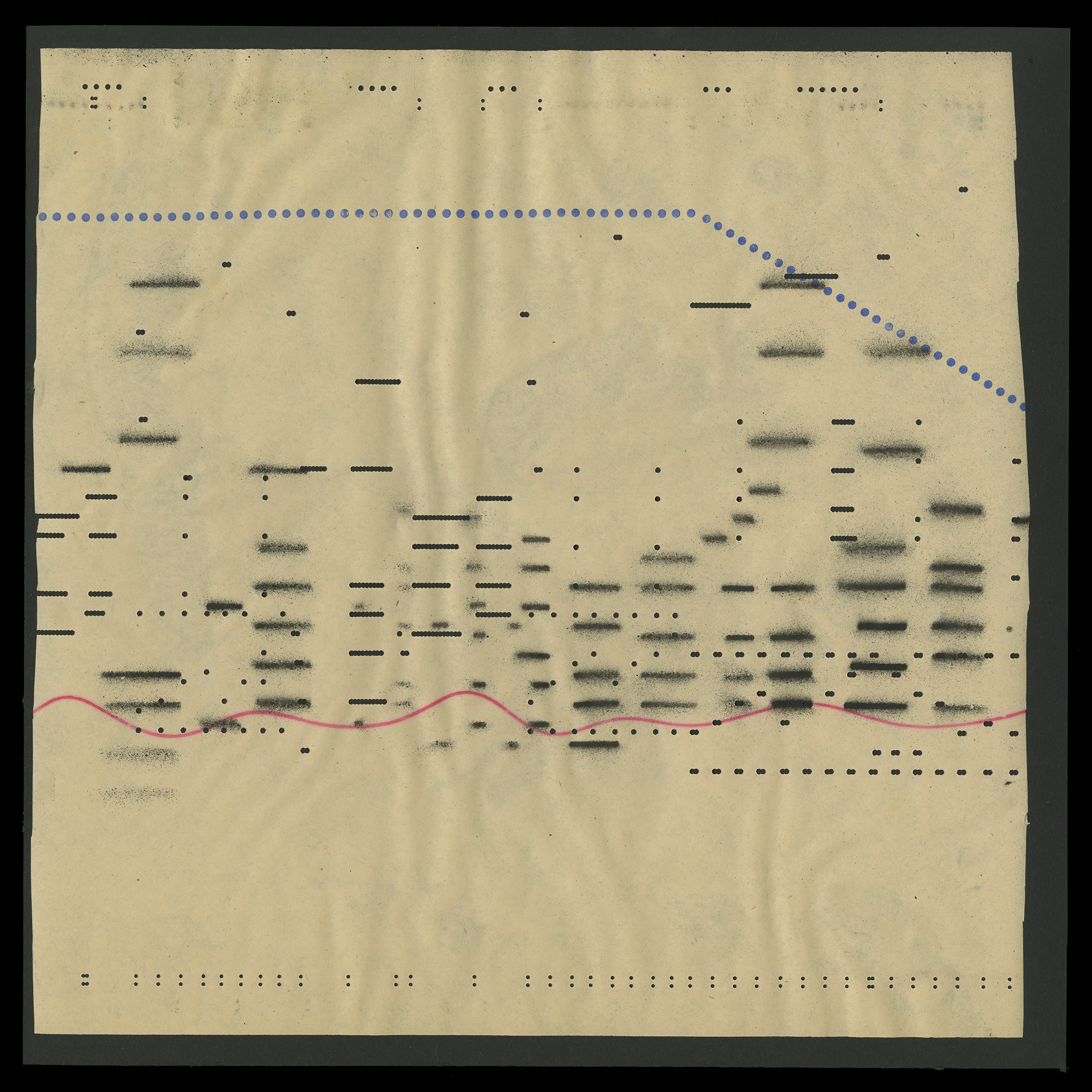
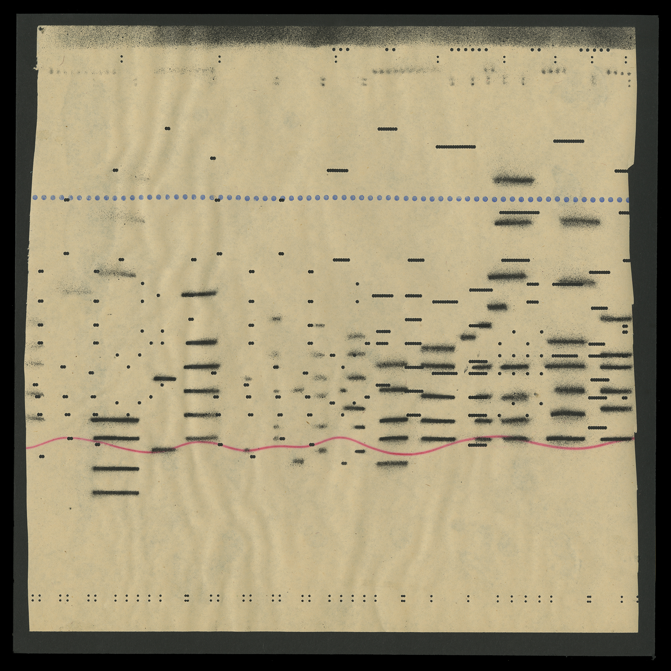
Another trope you see on the cover is a pattern that came from a piano player roll. I have always been fascinated by player pianos and how they resemble the interface of a digital sequencer. I liked how they felt like spirits or ghosts from the past, passing through, and looking down on the person on the cover.
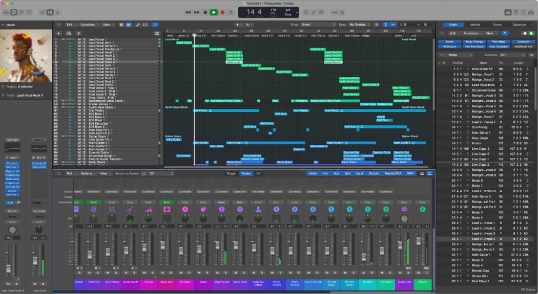
Example of Apple’s Logic Pro digital music creation tool

More info at cinaart.com




 01
01Ladder4x6
Early sketch for cover with photo
 02
02_RedChartBlack
 03
03_RedChartBlack02
 04
04Enamel
05
Art used for Greta Series
Photography Greta Cina
 05
05Photocopy from college archive
 06
06
07
Label_A1 Treatment Explorations

08
Label_A2 Treatment Explorations
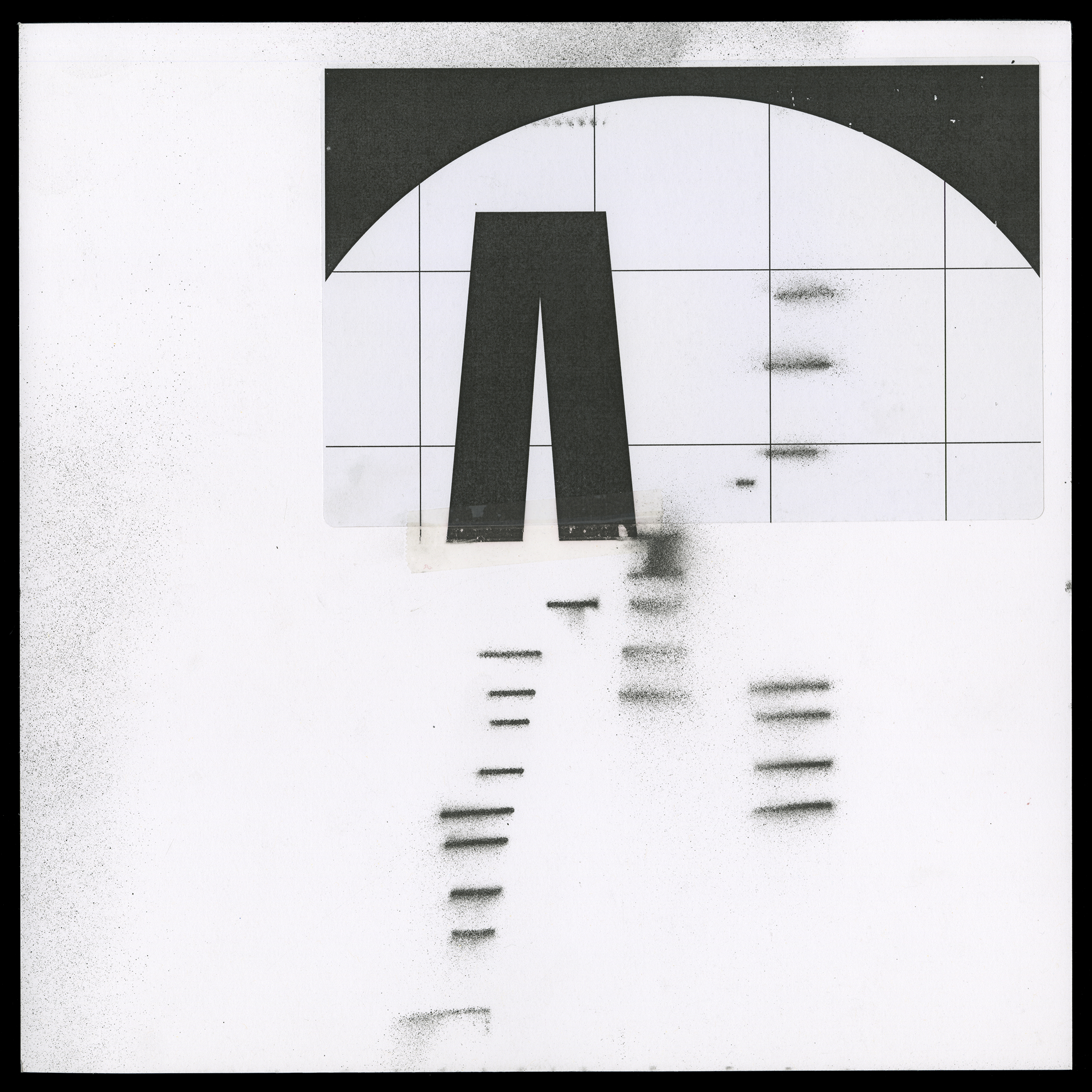
09
Label_B1 Treatment Explorations
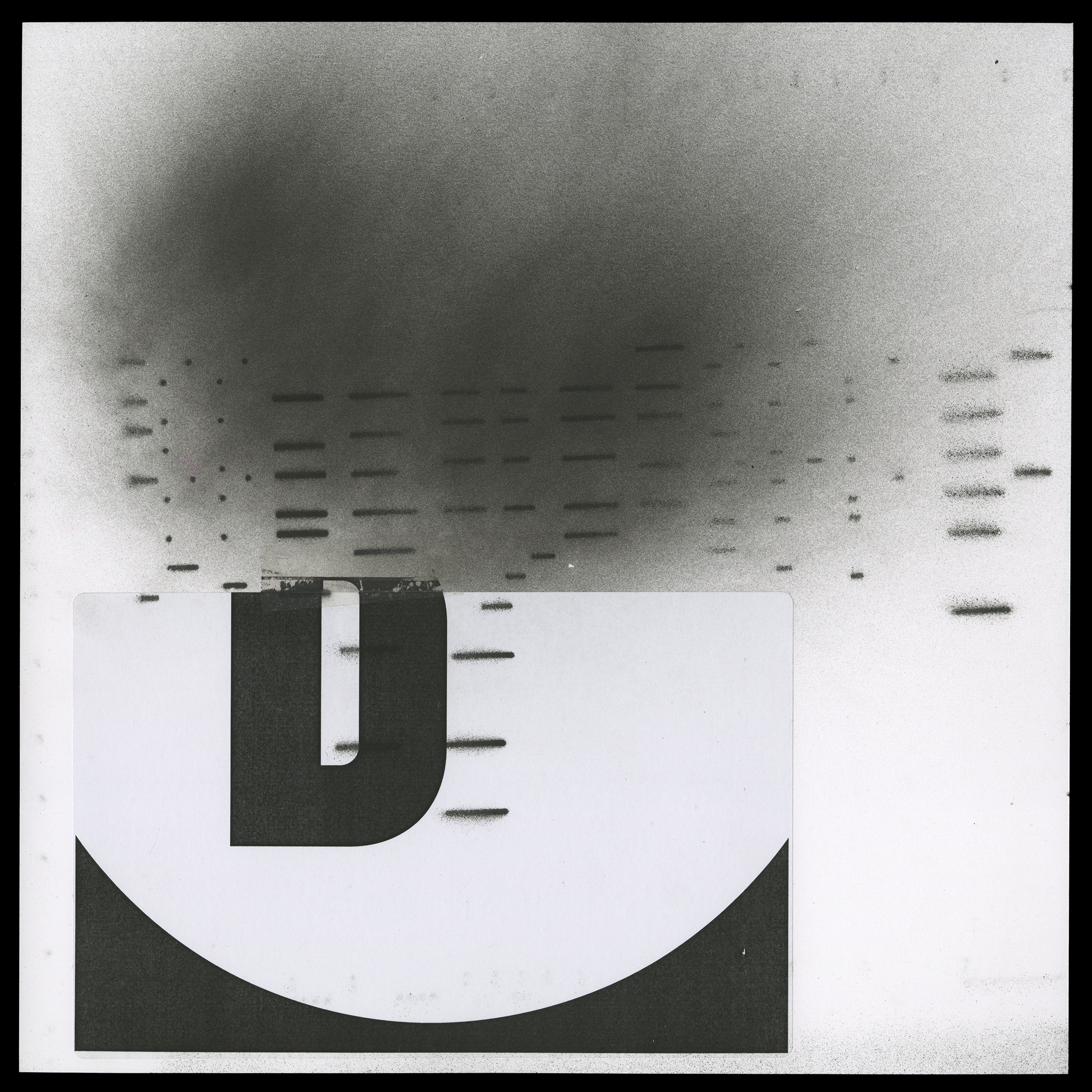
10
Label_B2 Treatment Explorations

11
Label_A Treatment Explorations
 12
12Label_A Treatment Explorations
 13
13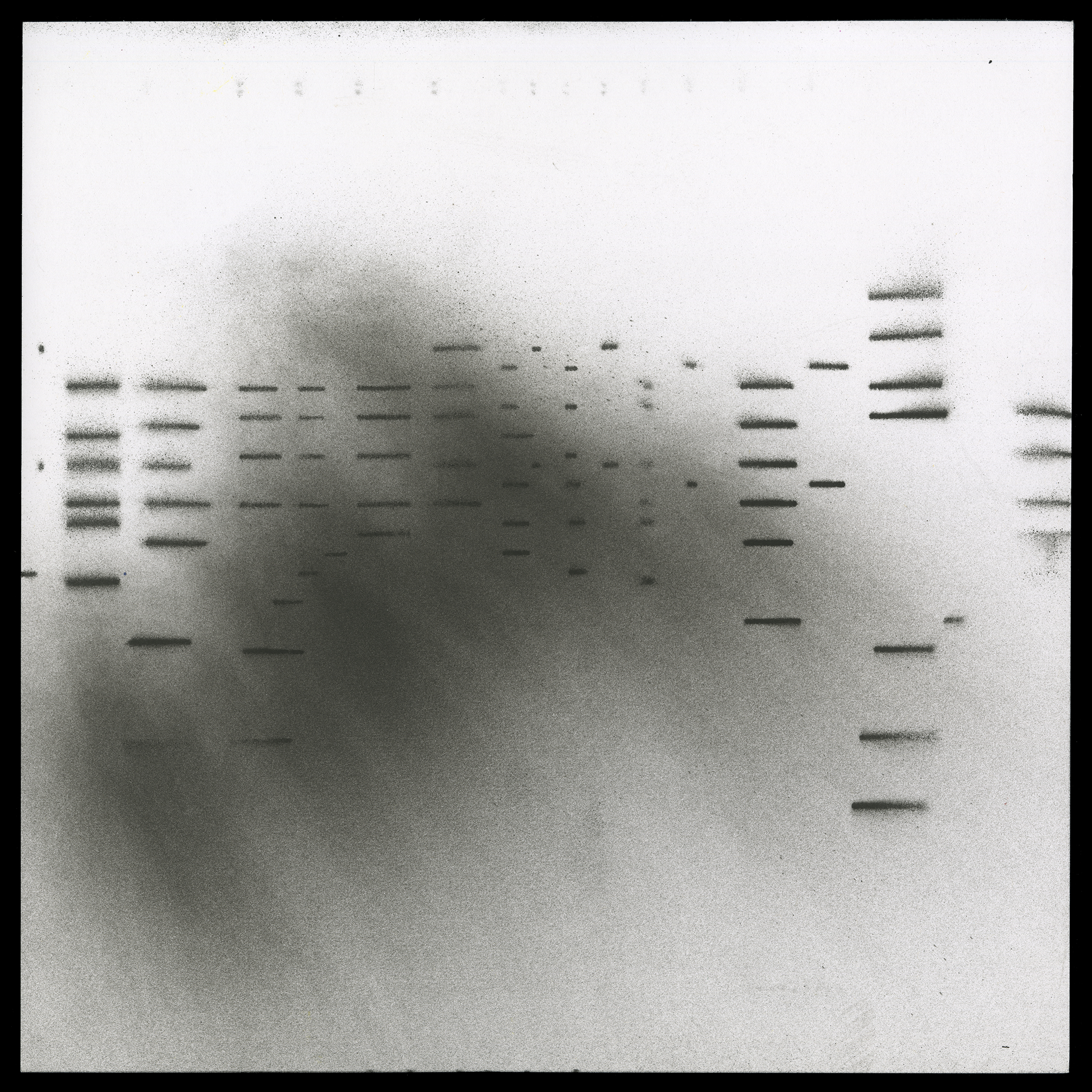
14
 15
15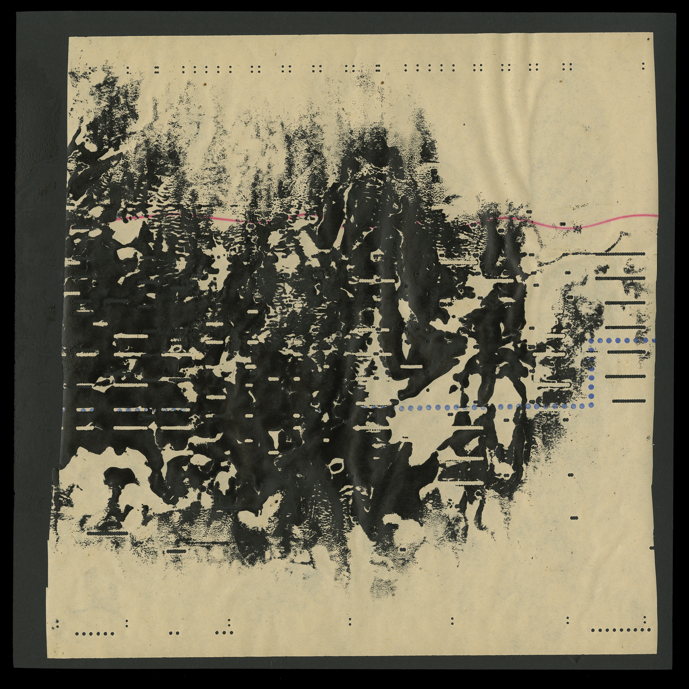 16
16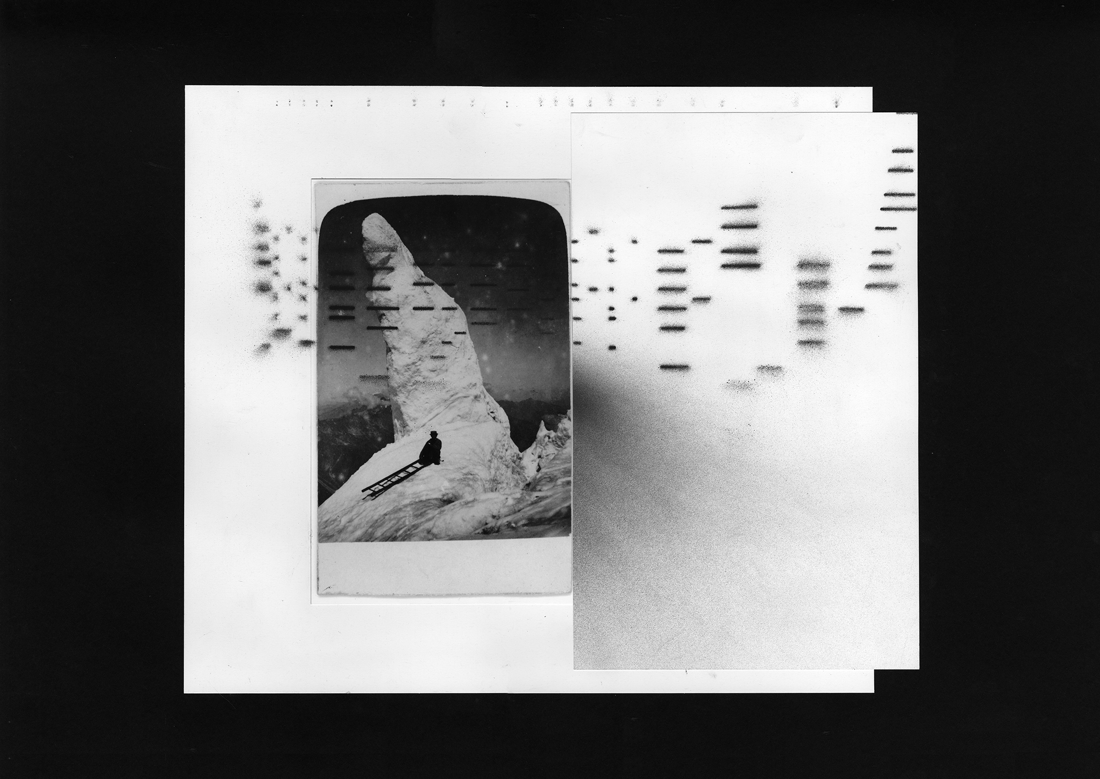 Potential collage for front cover.
17

 19
19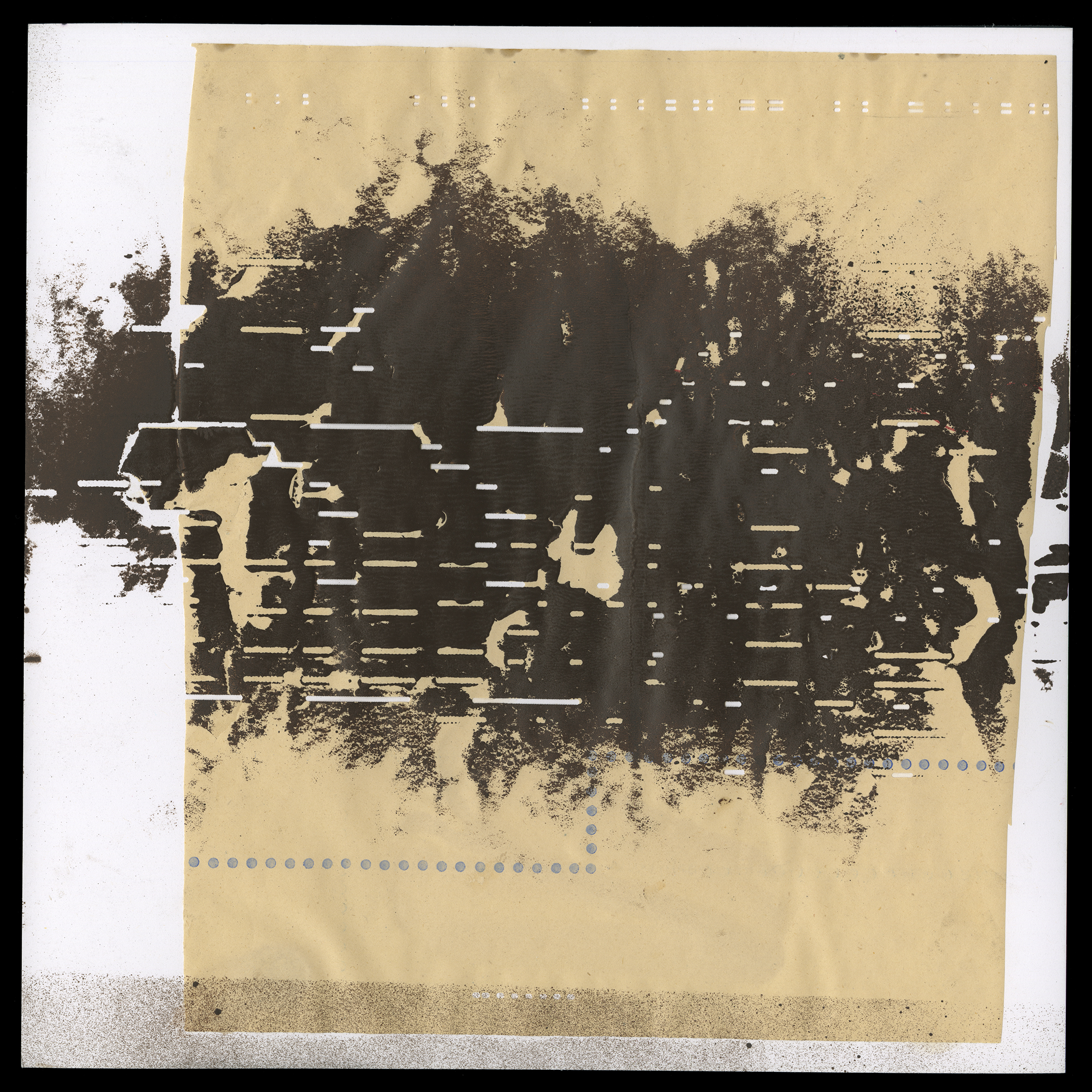

21

 23
23
 25
25
26

27
 28
28ThousandEyes_TanWhite
 30
30 31
31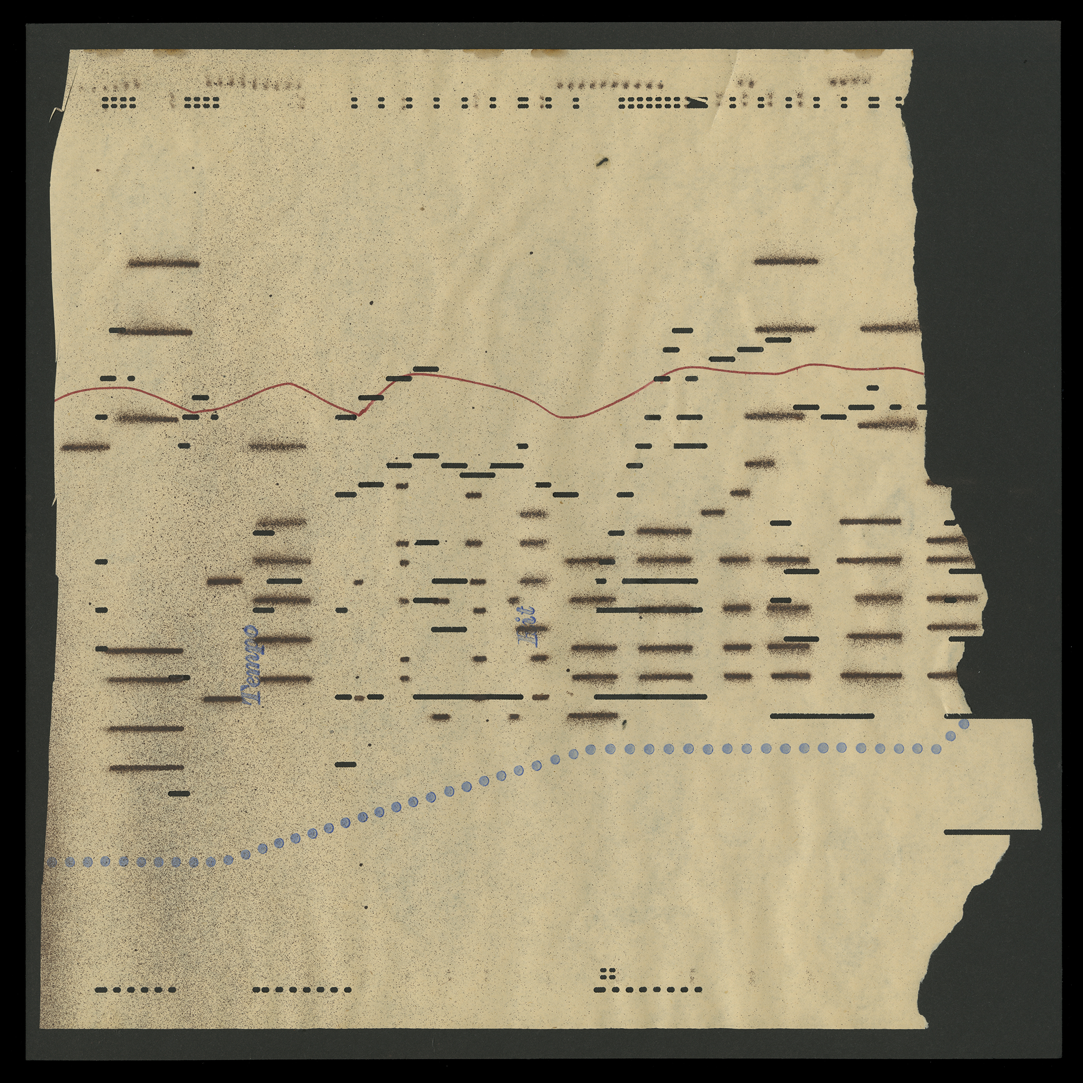
 33
33
 35
35

37
One of the reasons I did so many panels is I had imagined making a box set that had a lot of artifacts from the process as a limited edition. Also, the more you sit with something, the more you start to understand what needs to happen and what is working.
If interest in purchasing any of these, please contact me.
If interest in purchasing any of these, please contact me.

 39
39 40
40
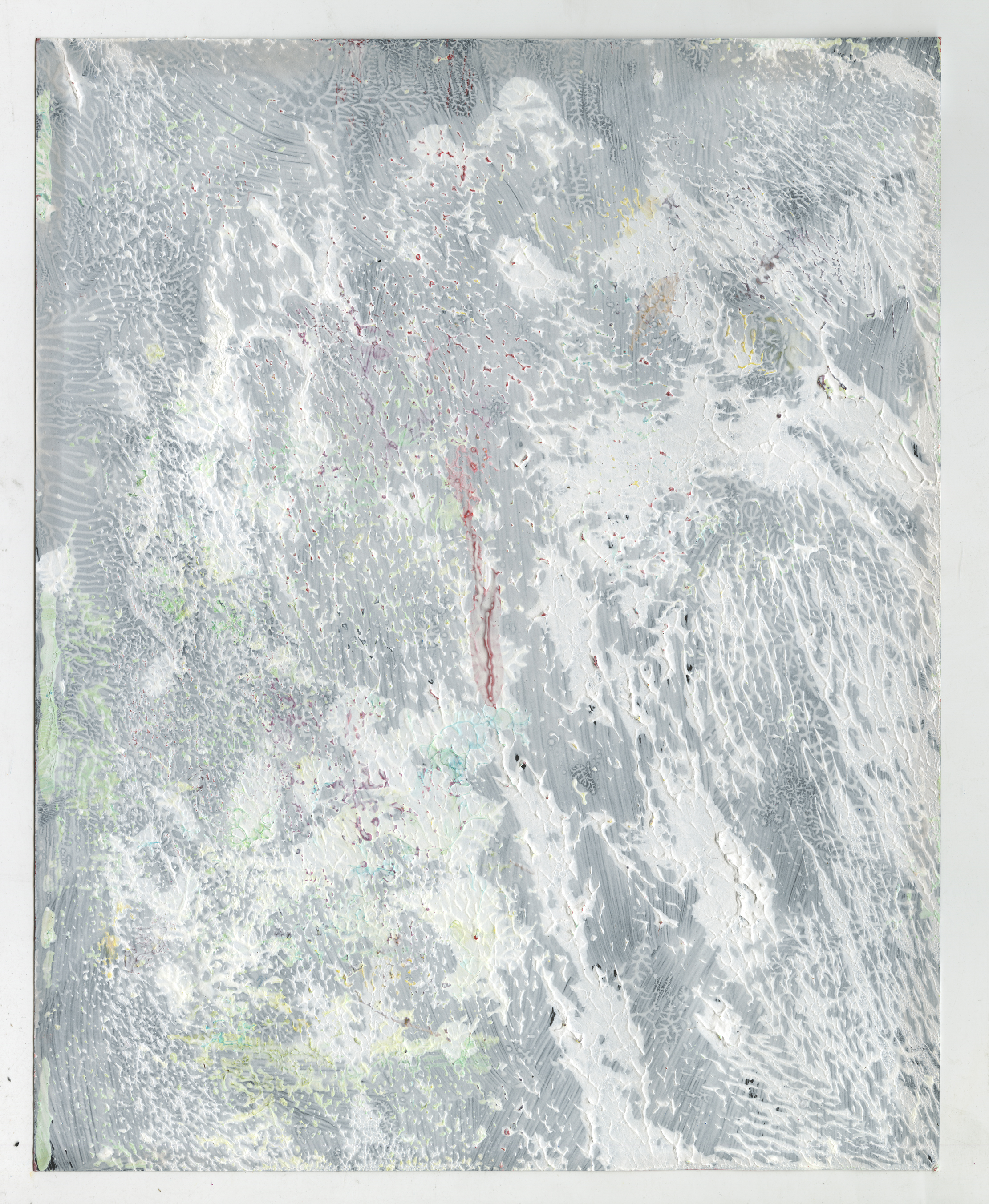
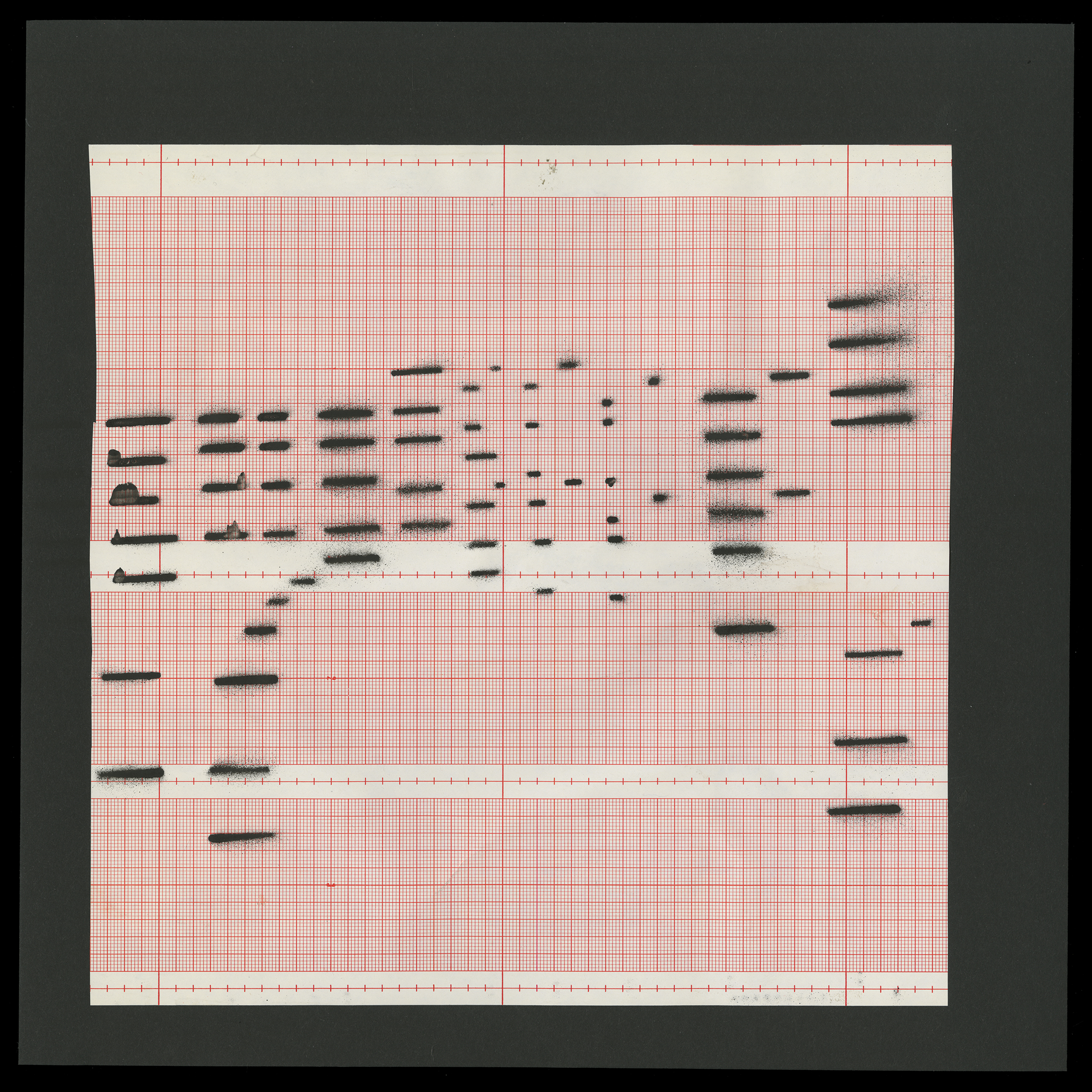
Raw scans were used on the final. If you look you can see the edges, breaking the fourth wall a bit.

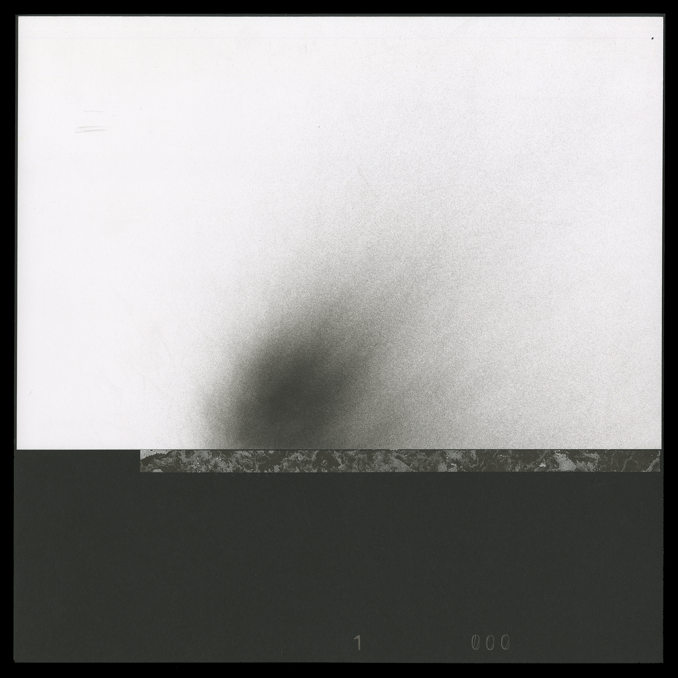
I did a series of these and really love them. They remind me of Stracciatella Stones.


 41
41
 44
44
45

 47
47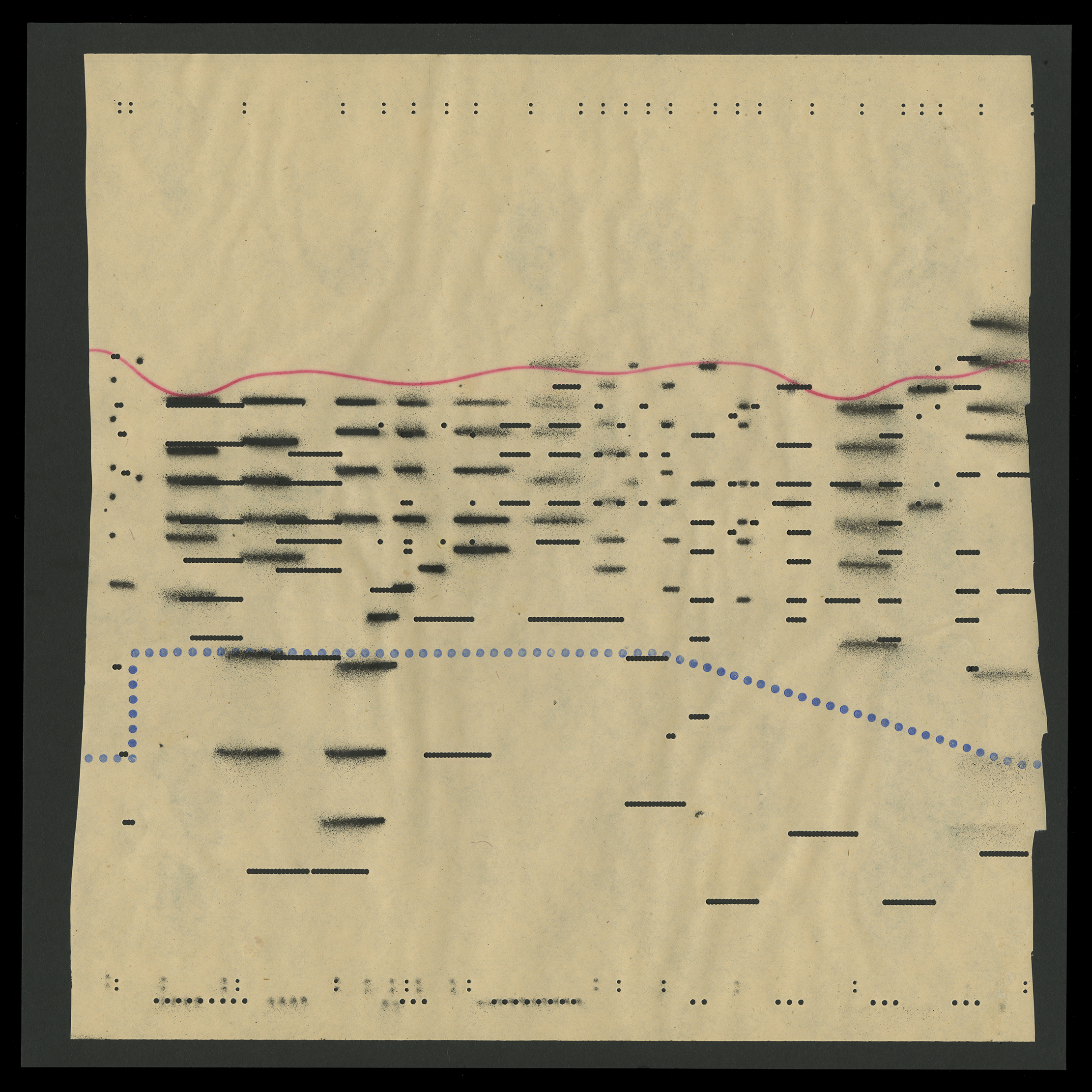
 49
49 50
50There’s more but this is a good crossection to get an understanding of the breadth.

6 foot printout in a friend's studio. I had the idea to take this piece around and photograph it in different settings.

All of these are tests to see how it would work in different situations and locations.


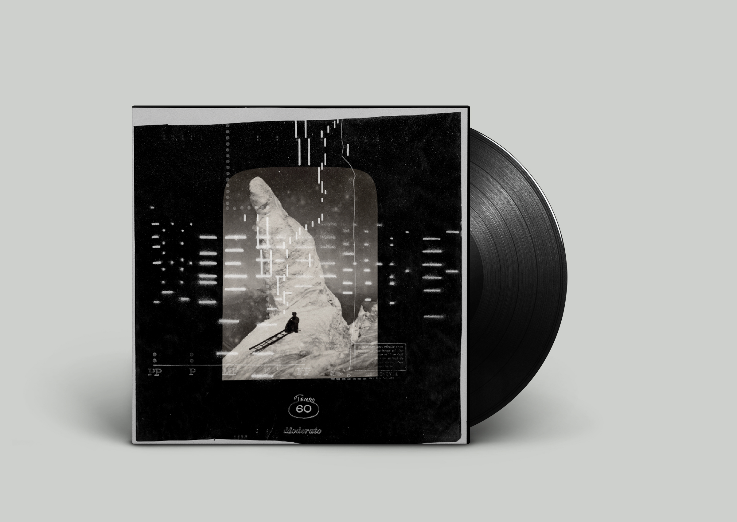 Too retro.
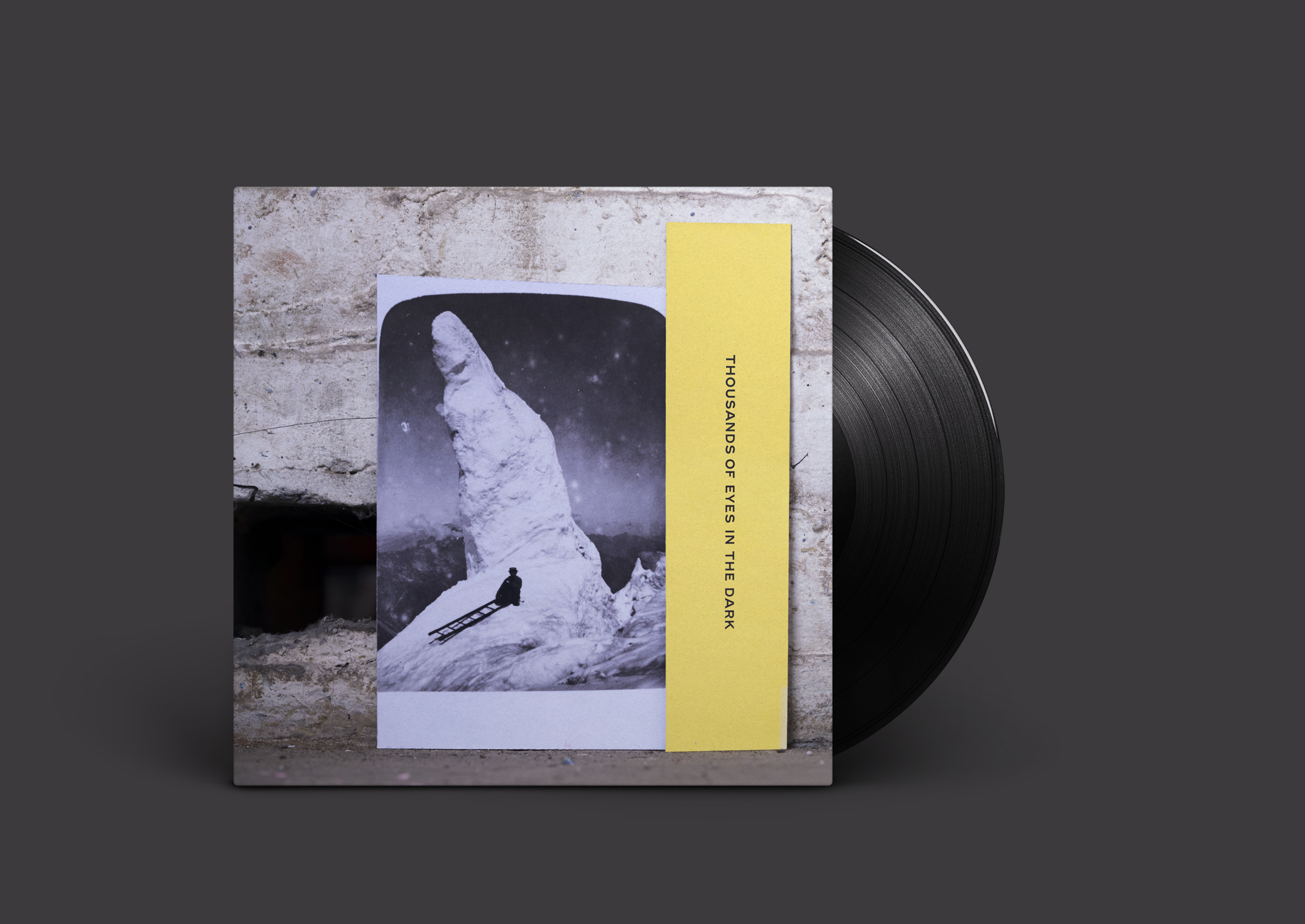
Test to see if name cards as title would work

 in window with joyce.
Back of canvas
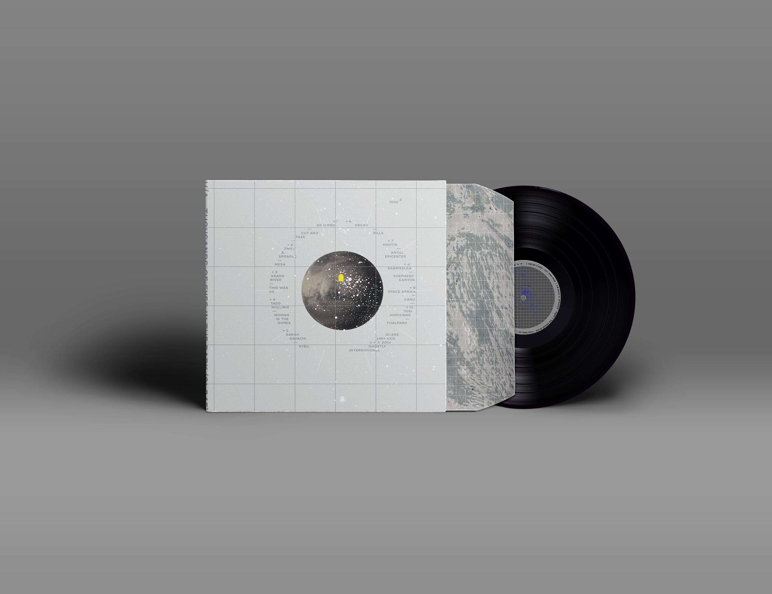
Milky Way Version

Single consideration but they were never needed.
SMM LOGO
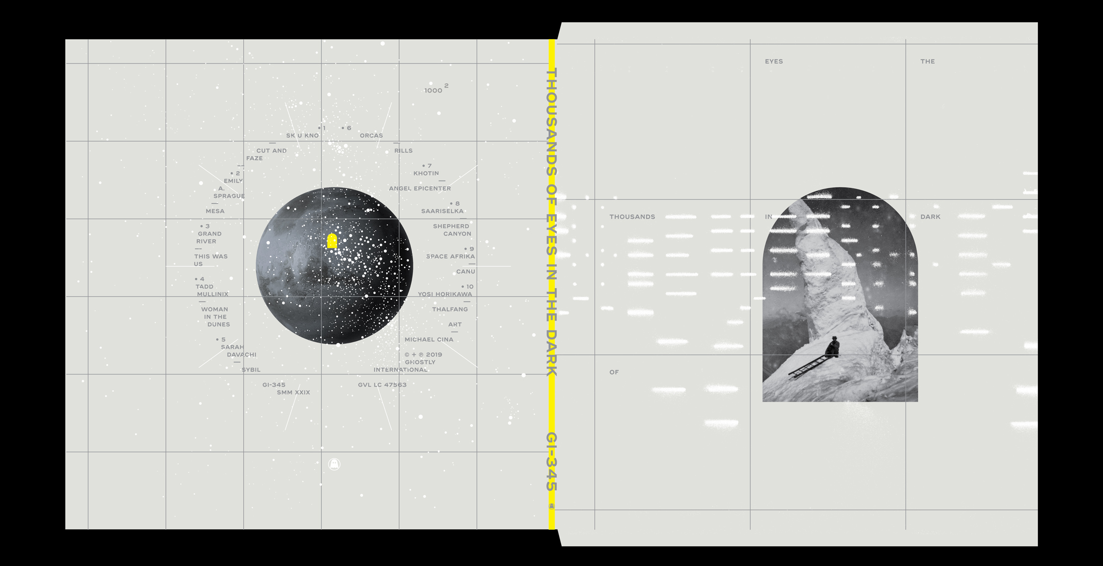

Extras
The project had a false start a year before the final version started and was asked for some preliminary ideas. I don’t remember under what lens it was presented but here are a few of those from one day’s work.
